My design process began with in-depth research and brainstorming sessions to understand DDG Windows’ brand values, target audience, and market positioning.
Services
Client
Year
Website

Challenge
Our client needed a brand refresh to better reflect their evolving business values and appeal to a younger demographic.
Concept Development
My design began with in-depth research and brainstorming sessions to understand DDG Windows’ brand values, target audience, and market positioning. The key attributes we aimed to convey through the double-glazing windows rebrand were:
Quality: High-end craftsmanship and superior materials.
Innovation: Modern designs and advanced technology.
Trust: A reliable and customer-focused approach.
Design Elements
The logo design incorporated the following elements:
Symbol: A sleek, stylised window representation, signifying clarity and openness.
Typography: Modern, clean typeface to complement the symbol and enhance readability.
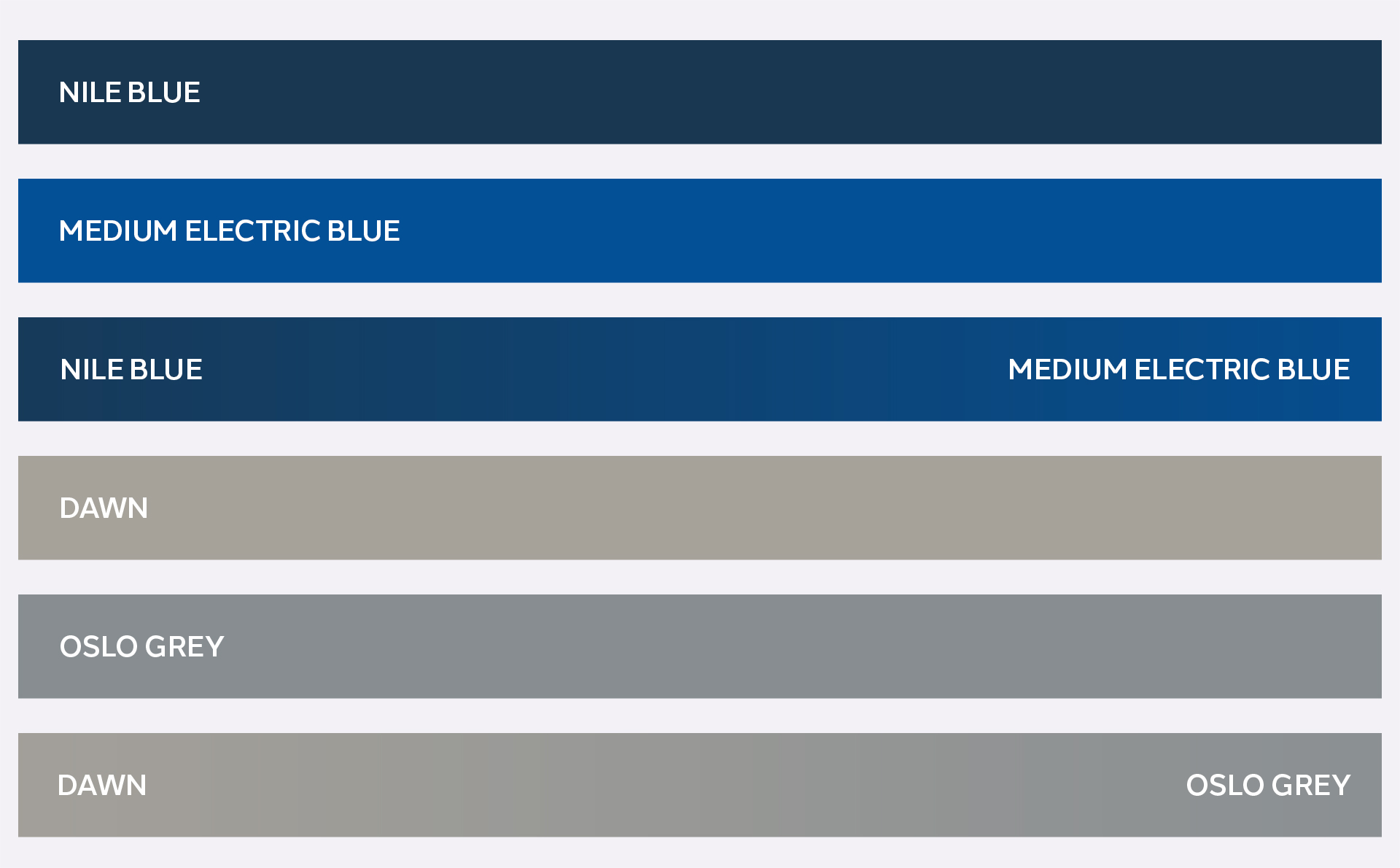
Colour Scheme: A refined palette of blues and greys, conveying professionalism, trust, and reliability.

Goal
Final Design for Double Glazing Windows Rebrand
The collaboration between BMDC and DDG Windows resulted in a robust and distinctive brand identity that enhances brand recognition and reinforces the company’s commitment to quality and innovation. The new logo and brand guidelines provide DDG Windows with the tools to maintain a consistent and professional image across all touchpoints, paving the way for continued success in the market.

