Vijay’s Virasat: Brand Identity for a Three-Generation Restaurant
The finished Vijay's Virasat lockup
The brief
A restaurant with a genuinely rare story: starting as Vijay’s Sweet Mart, growing into Vijay’s Chawalla’s street food, and now Vijay’s Virasat’s full vegetarian and non-vegetarian menu, spanning three generations of the same family. The brand needed to carry that real history, not invent a generic “authentic Indian cuisine” story from scratch.
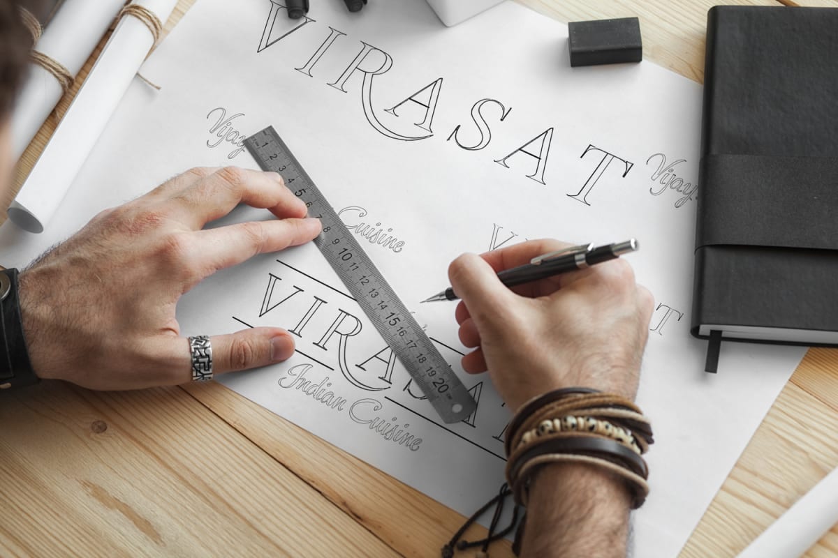
The mark drawn by hand before it went near a screen
The build
A logo drawing on traditional Indian motifs, paisley patterns and mandala forms, built with lines clean enough to stay legible across menus, signage and packaging instead of becoming an ornate mark that falls apart at small sizes. The colour palette (saffron, deep green, terracotta) evokes spice markets and traditional dining without tipping into cliche, paired with a serif and sans typography pairing that balances heritage against everyday readability on a takeaway menu.
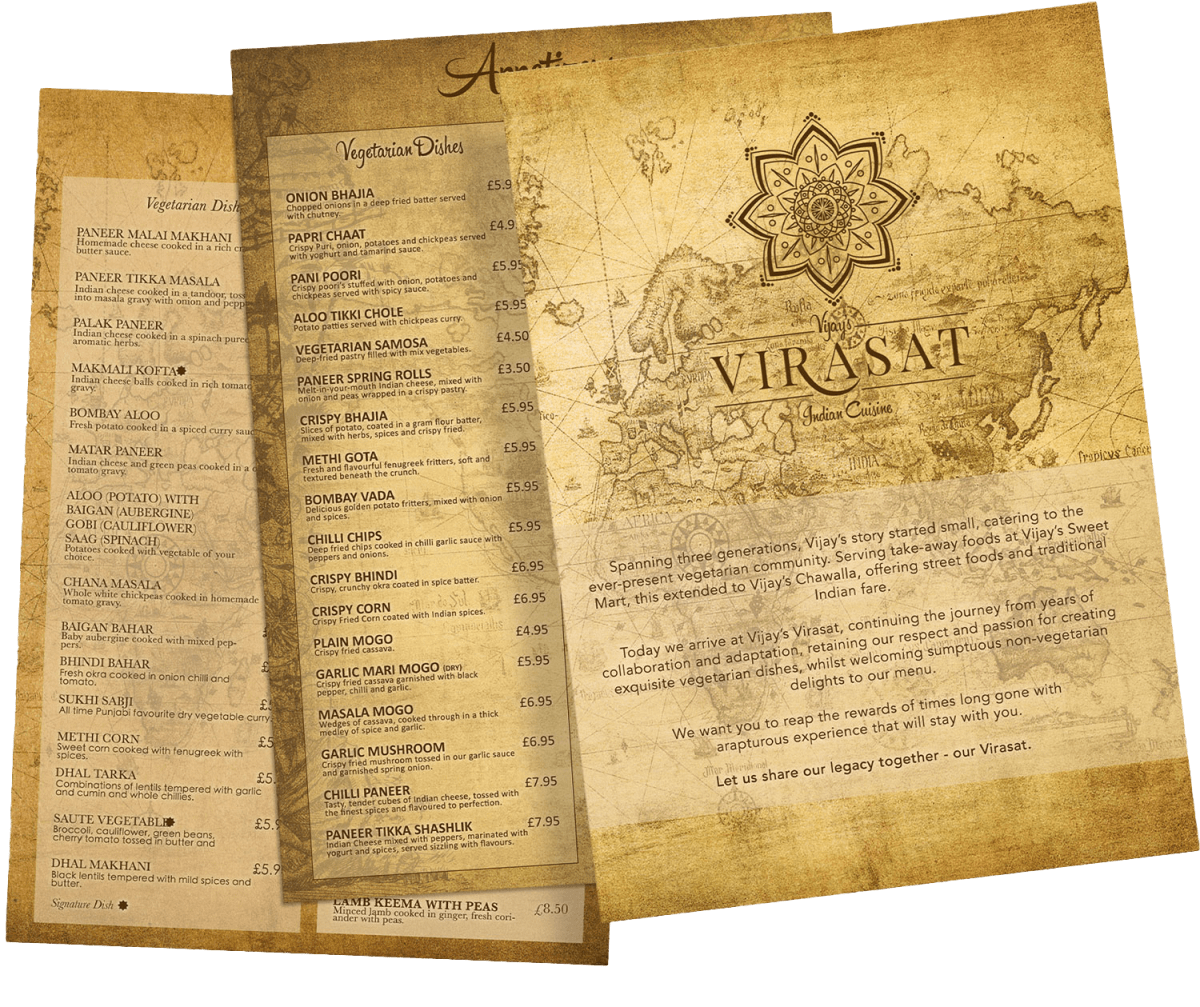
Mandala and paisley forms reduced to lines that hold at small sizesMenus printed on aged map stock, where the identity works hardest
The result
A brand identity that carries the weight of three generations of family history, positioning Vijay’s Virasat as a cultural anchor for the community it serves.
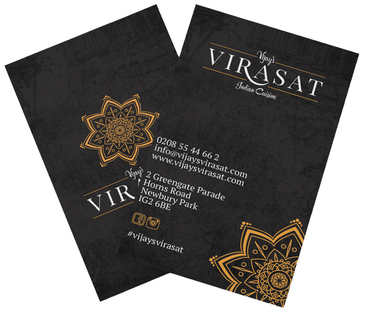
Business cards in saffron, deep green and terracottaFood photographed for the same set of materials
Tulsi Vagjiani: Personal Brand Identity for a Motivational Speaker
The Tulsi Vagjiani wordmark in gold
The brief
A personal brand for a motivational speaker and plane-crash survivor whose story needed an identity that could carry its weight without ever tipping into anything exploitative or overly dramatic.
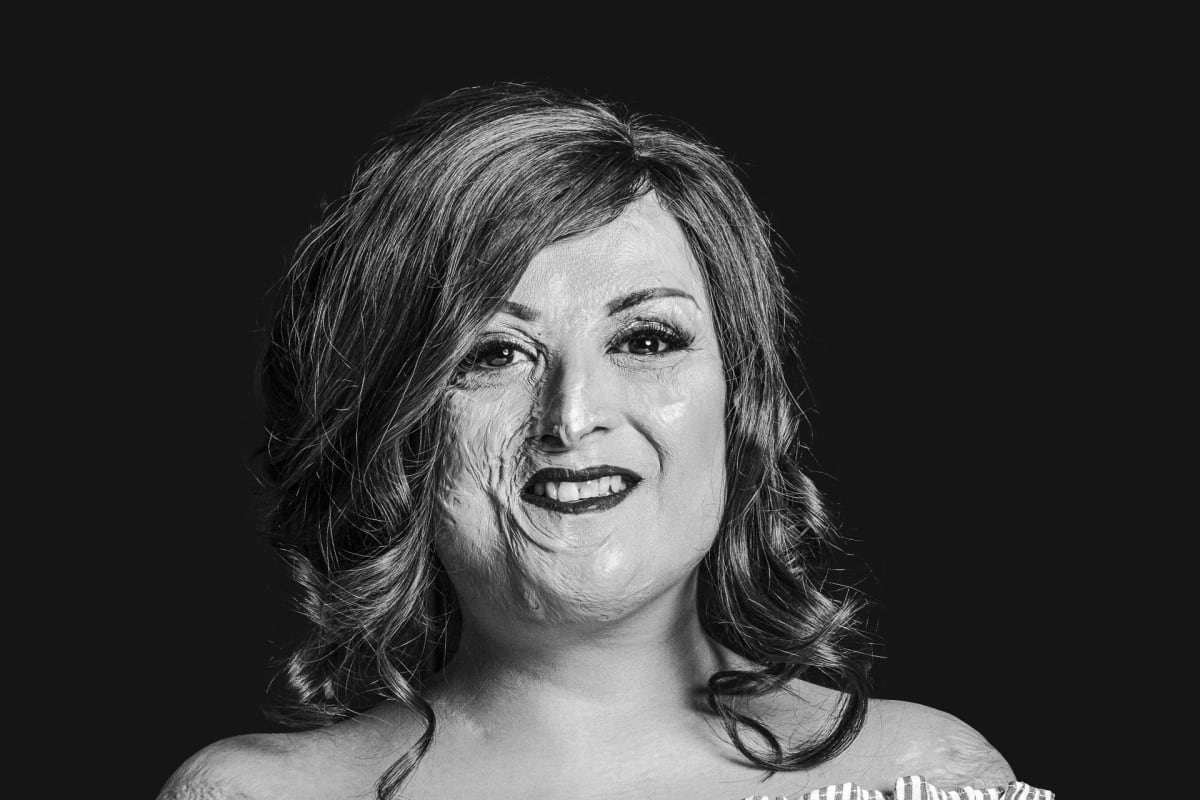
Portrait photography kept plain and direct
The build
A minimalist, luxury-leaning identity: a considered colour palette, refined typography, and a logo built to work as hard on a website as it does across speaking engagements, designed to let the story itself carry the emotional weight instead of a busy or sensationalised visual treatment.
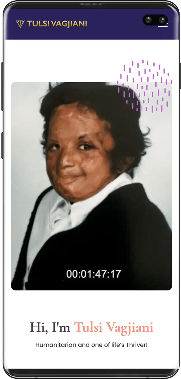
The mobile homepage introducing Tulsi in her own wordsVideo-led hero on the phone, where most of her audience arrives
The result
A personal brand serious and considered enough to match the story behind it, giving Tulsi a consistent identity across her website and speaking platform.
Photography used at full width, never as decorationA styled portrait from the same shoot, used on the speaking pages
Does your personal brand carry your story with the weight it deserves?
Protech Autocentres: Brand Identity for a Vehicle Service Centre
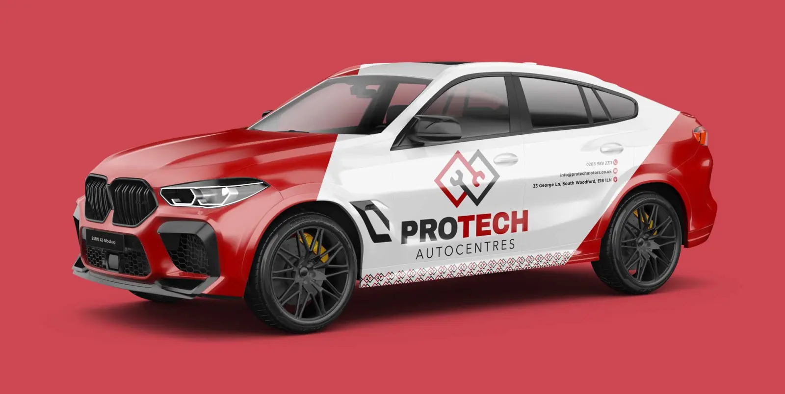
The livery concept: a trust mark, not a motorsport decal
The brief
A vehicle service centre needing a brand and website professional enough to build trust with customers handing over their car for work they cannot see happening.
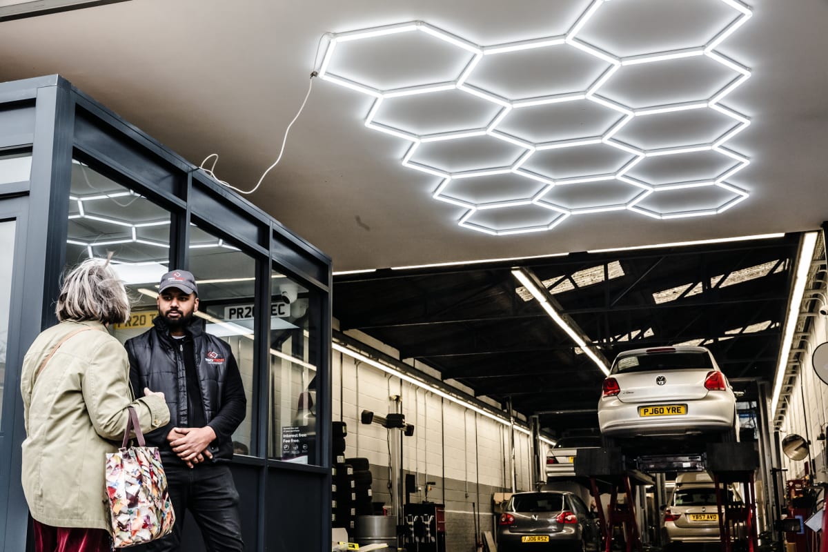
The Protech workshop on the day of the shoot
The build
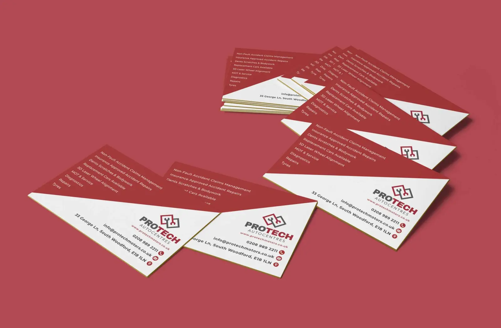
A clean logo and identity built around clarity and trust in place of motorsport cliche, carried consistently through business cards and a website structured around the services on offer, so a visitor can see exactly what the centre does before picking up the phone.
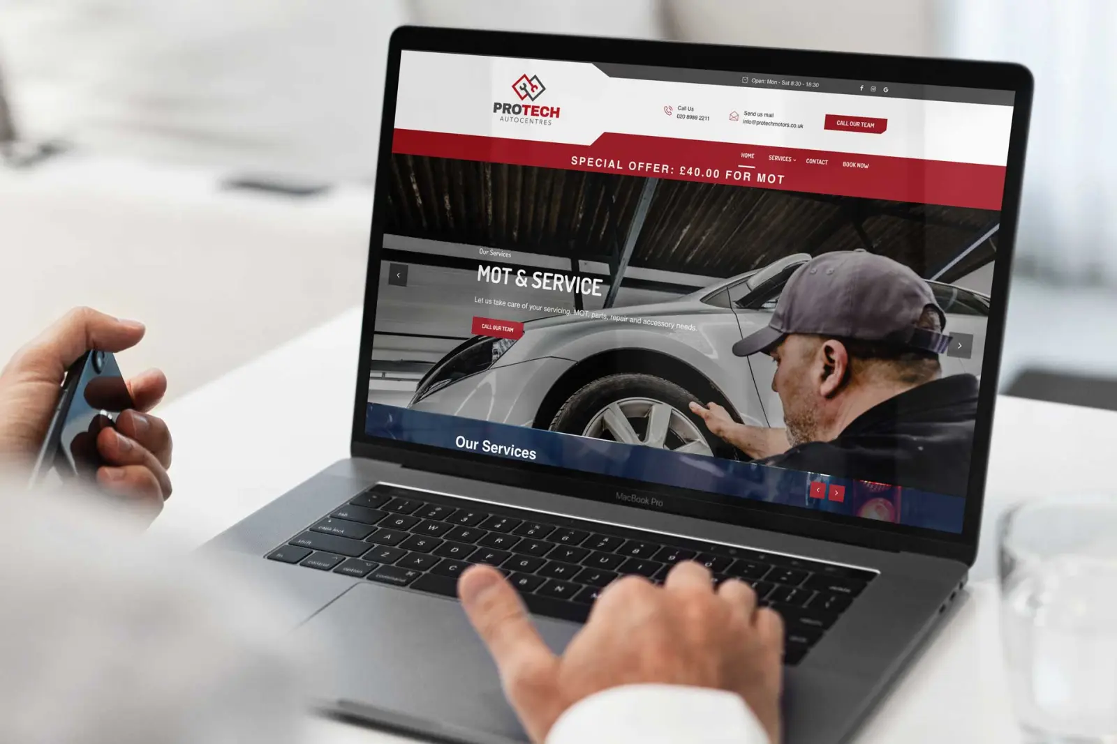
The spanner and ramp mark locked up on the redThe site built around booking an MOT or a service
The result
A consistent, professional identity across the touchpoints customers judge a garage on before they book anything in.
Business cards carrying the same red, grey and whiteCustomers in the workshop under the hex lighting
Want a trade brand that earns trust before a customer walks in?
The Triage Vets mark, a dog and cat silhouette in the practice teal
The brief
A veterinary practice needing a brand that read as trustworthy and reassuring to someone bringing in a worried pet: not clinical and cold, but not twee either. The existing identity reflected neither the atmosphere of the clinic nor the village setting it sits in.
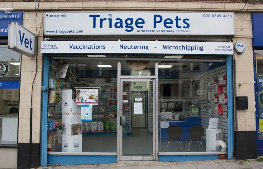
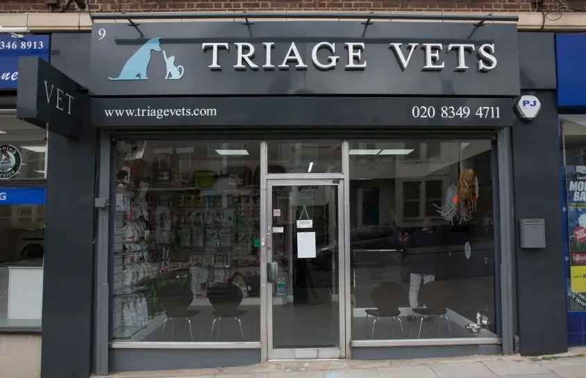
Before: the Mill Hill shopfront still signed Triage Pets
The build
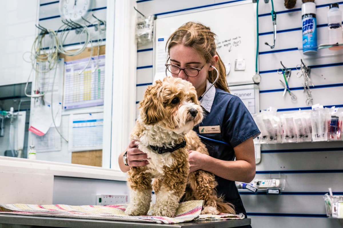
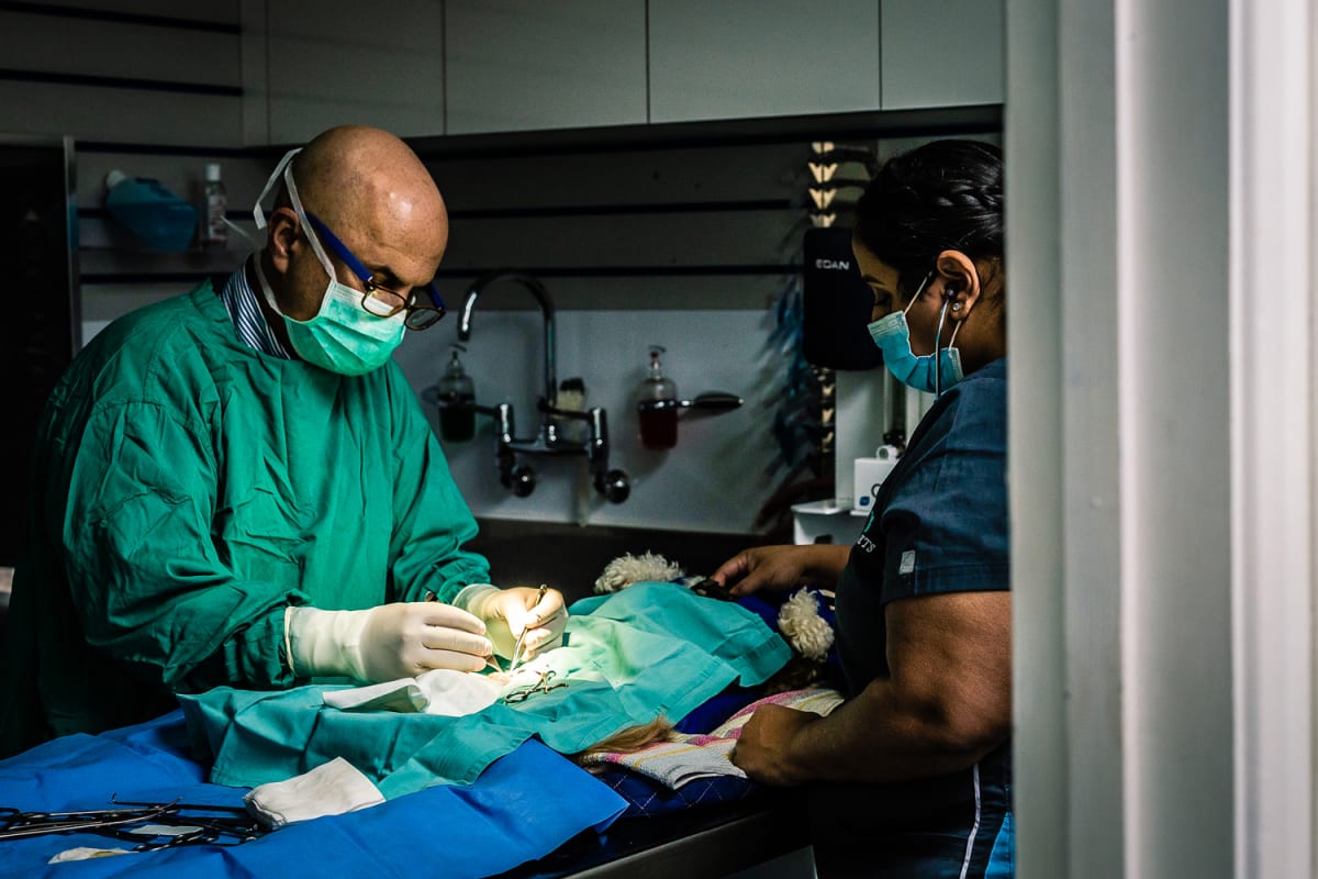
A seven-month rebrand covering everything from the logo to the storefront signage, drawing on the practice’s village surroundings to shape a warmer, more welcoming visual identity than a typical clinical vet brand. Photography captured the real space and team in place of stock imagery, and a social media strategy carried that same warmer tone into ongoing content, so the rebrand did not stop at the logo.
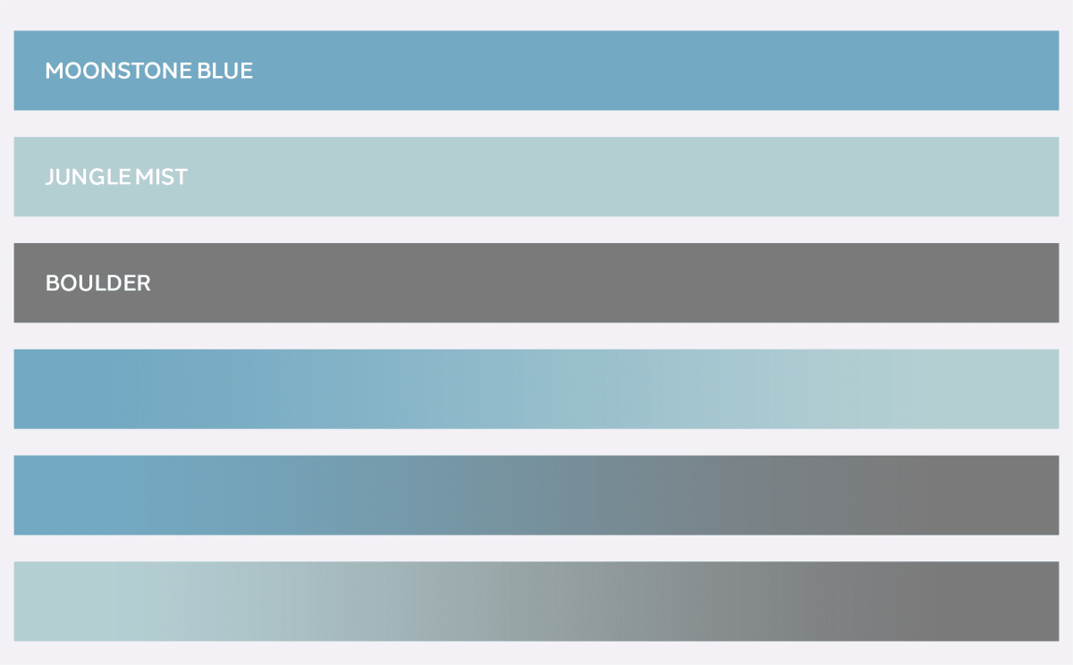
The palette, set around Moonstone Blue and Jungle MistAfter: the same frontage rebranded to Triage Vets
The result
A brand and photography set that represents how the practice treats its clients, pets and owners both, instead of defaulting to the generic clinical look most veterinary brands settle for.
The brand in use at the front deskClinical work photographed for the practice's own library
Should your brand reflect how your practice feels in person?
Metro Laundrette & Dry Cleaners: Local SEO and Social for a Neighbourhood Business
The Metro mark in the blue and red the shopfronts already used
The brief
A laundrette and dry cleaner needing a website and local visibility strategy built around how people search for this kind of service, terms like “laundry service near me” and “eco-friendly dry cleaners”, plus a social presence to stay visible between visits.
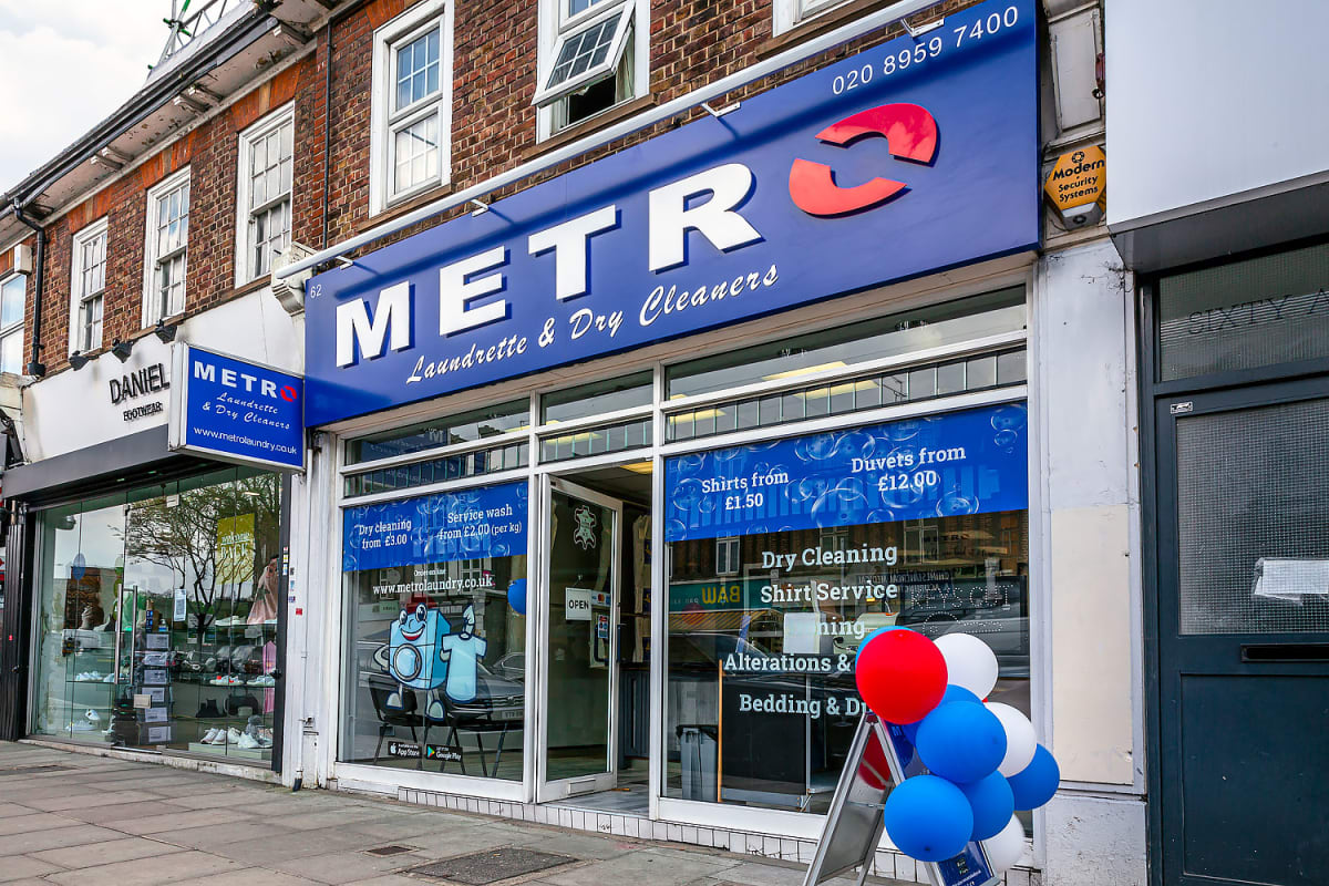
The Mill Hill shop on reopening day
The build
A redesigned website with SEO built around genuine local search terms, backed by a social content calendar and seasonal promotional material, back-to-school offers, loyalty programmes and seasonal posters, designed to keep the business front of mind for a service people do not think about until they need it.
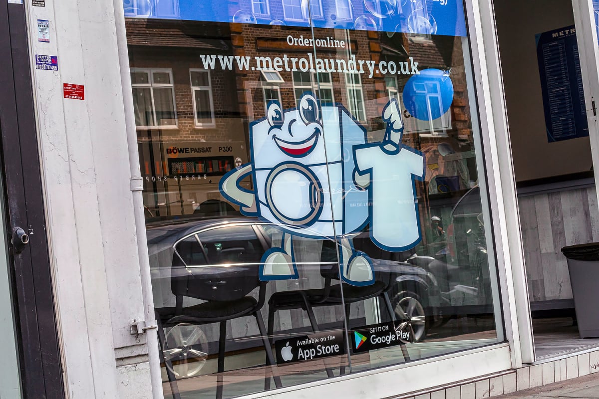
Window graphics carrying the mascot and the web addressOne of the seasonal social posts from the yearly calendar
The result
A Mill Hill business with a website and social presence built around how nearby customers search and decide, and a template for the kind of local work I do across north London.
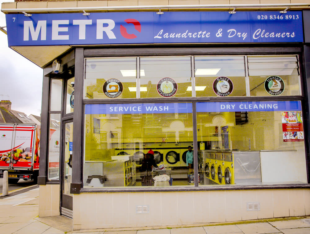
The second branch, same signage systemThe launch post for the online ordering service
Ready to be found by the customers already searching for you?
London Kings Clothing: Brand Identity for a Streetwear Label
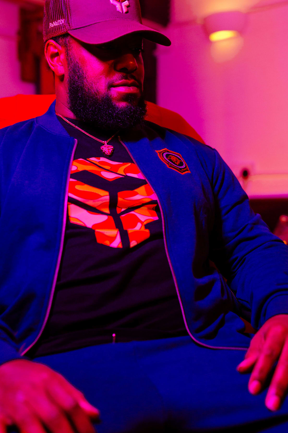
The range shot under club lighting, where the clothes get worn
The brief
An urban clothing brand needing an identity and social strategy bold enough to compete for attention in a crowded streetwear market.
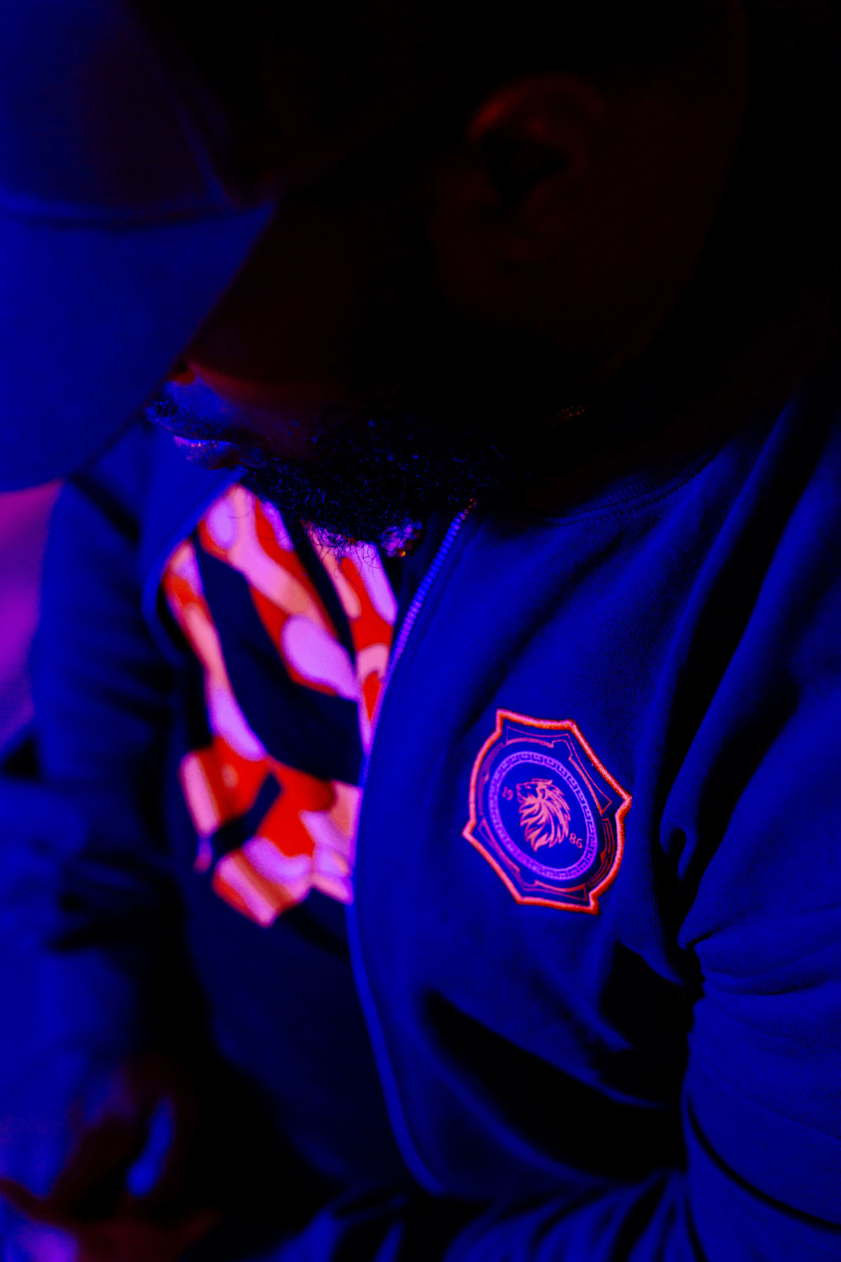
The gold crest, the anchor of the identity
The build
A bold, dynamic logo built to anchor a social-first brand, backed by a content and influencer strategy across Instagram, TikTok and Facebook, the platforms where a streetwear audience discovers and buys, in place of a traditional retail marketing approach bolted onto a fashion brand it does not fit.
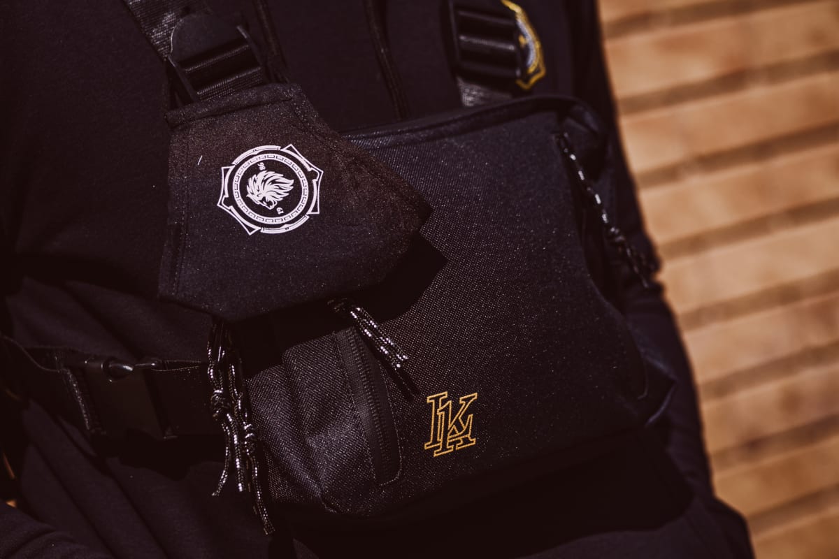
Embroidery detail on the navy hoodieThe chest rig bag, shot as its own product
The result
A brand built specifically for how a streetwear audience discovers and buys, not a retail identity retrofitted for social media, for a label competing for attention across London.
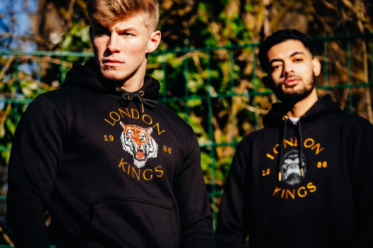
Two pieces from the drop, styled togetherNeon set: the campaign's closing look
Want a fashion brand built for where your audience is?
High Five Family Fitness: Local Fitness Brand & Booking Site
The High Five mark: a hand, five fingers, nothing more
The brief
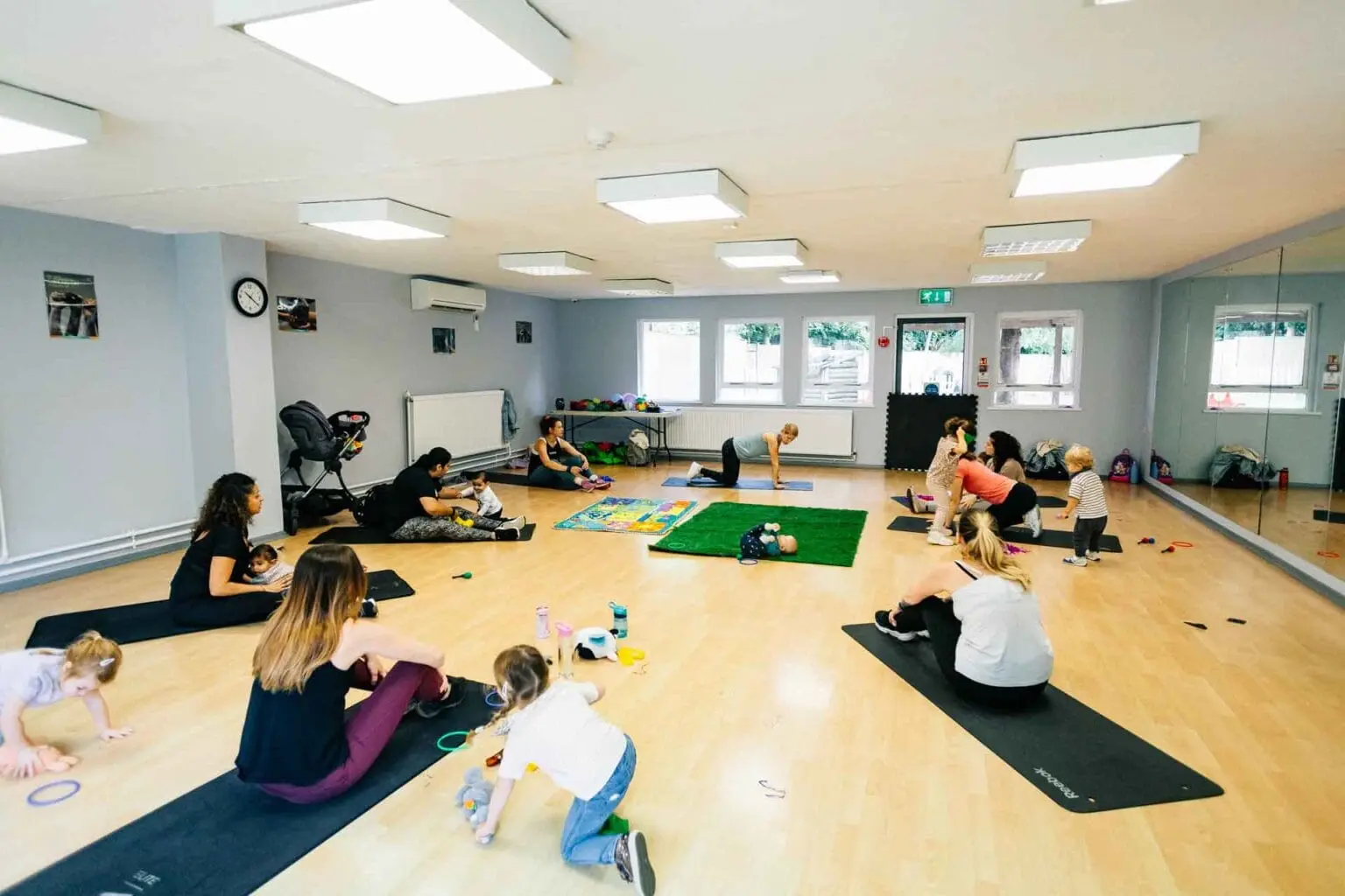
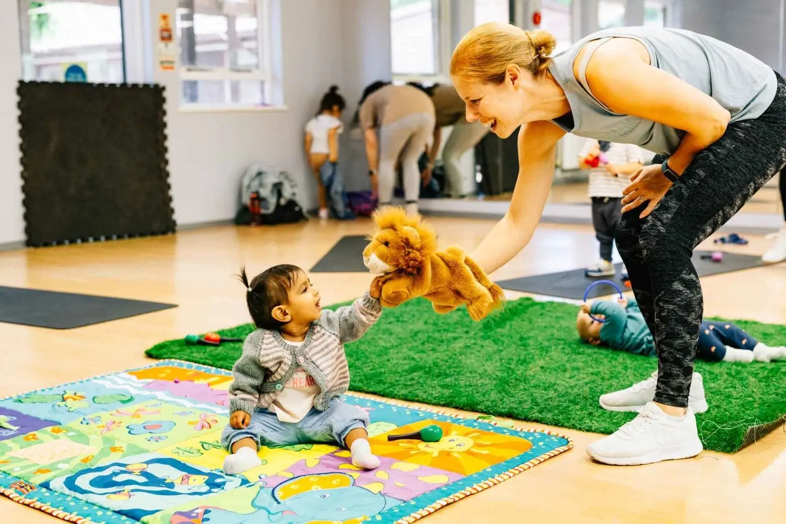
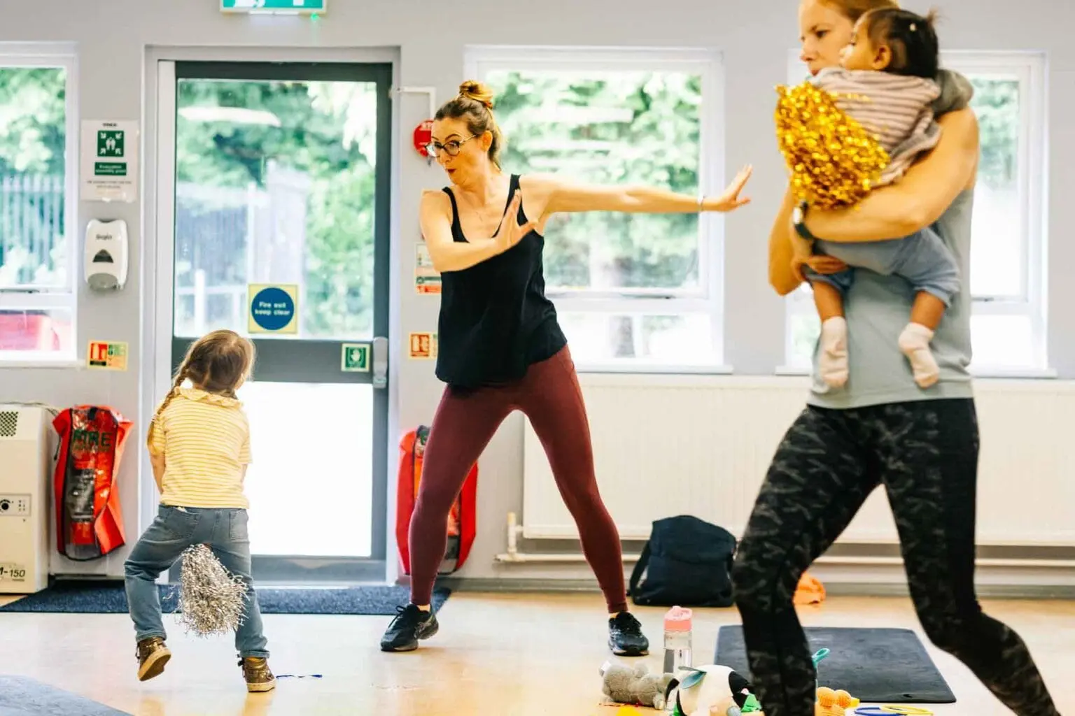
A Watford family fitness class, sessions blending exercise with music and movement for parents and children together, held at the YMCA in Leavesden Country Park, needed a brand and booking system that matched the energy of the classes.
A class at YMCA Leavesden Country Park
The build
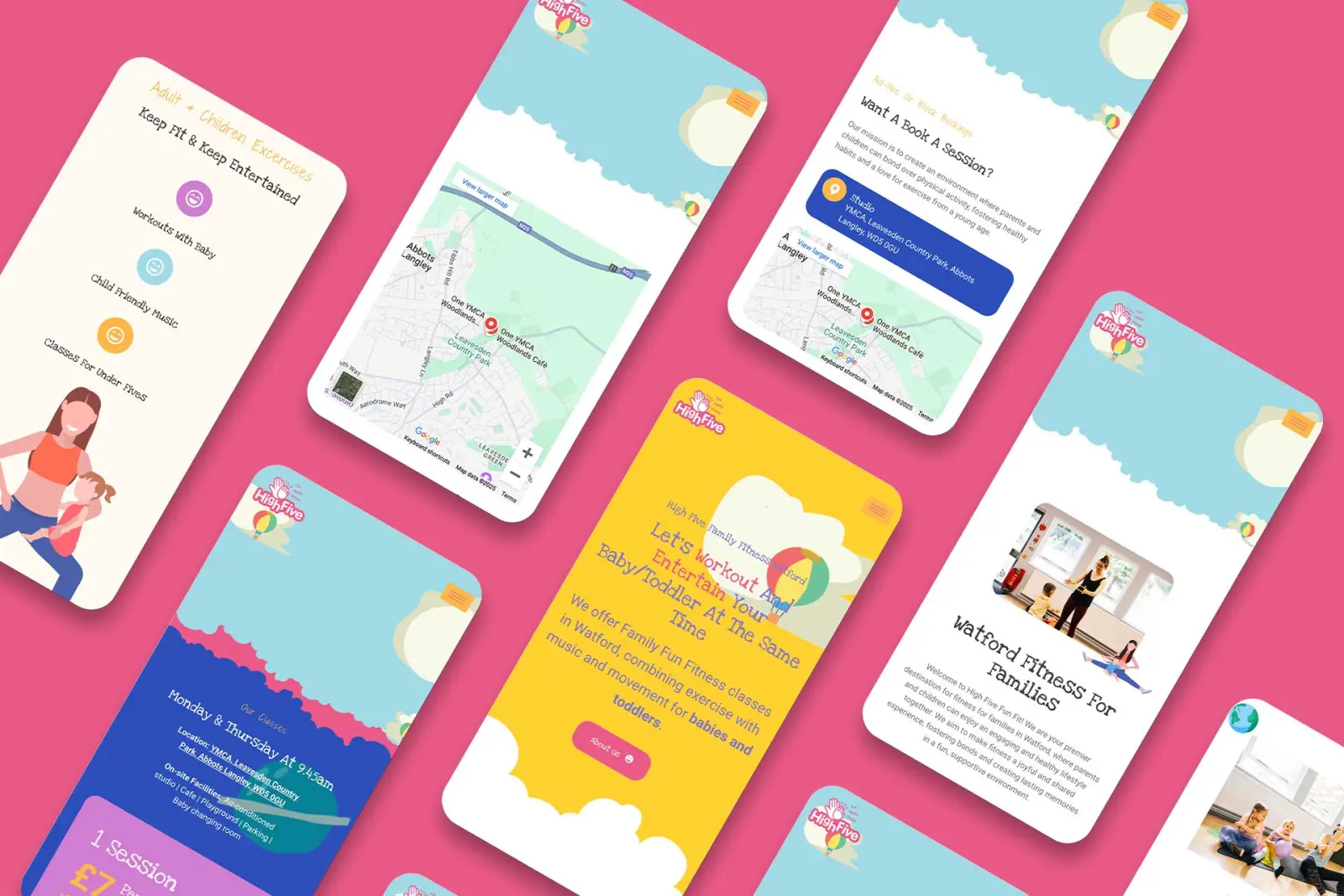
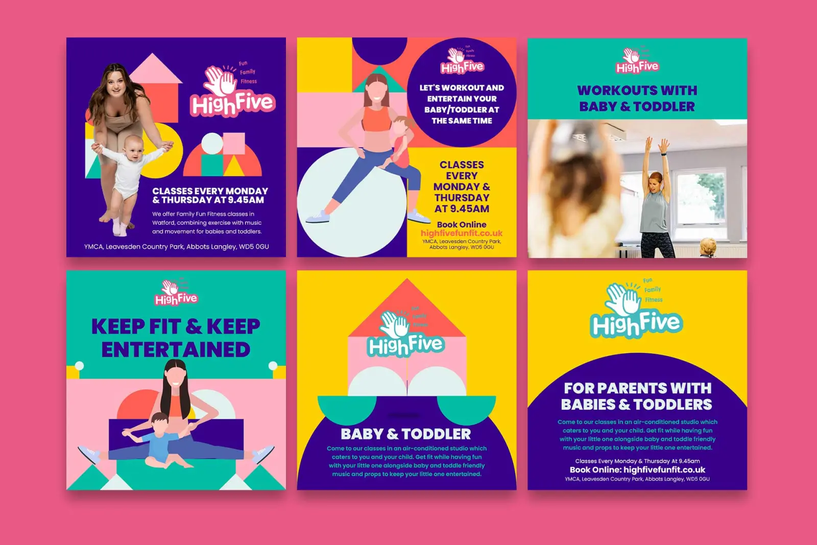
A playful, energetic identity built around fun and family togetherness in place of the serious, clinical tone most fitness brands default to, carried consistently across the site, promotional materials and social media. The site itself centres on an interactive booking system so families can register and manage their own class schedule directly, alongside local SEO work targeting exactly the kind of search a parent nearby would type in.
The booking flow as it appears on a phoneSocial templates built so they can be filled in in-house
The result
A brand and booking experience that takes a specific local audience, families in and around Watford looking for something to do together, from a search result to a booked class with as little friction as possible.
Mum and baby mid-class, the shot the site leads withThe end of a session, which is what the brand is selling
Al Jannah Villa Marrakech: Brand Identity for a Luxury Villa Rental
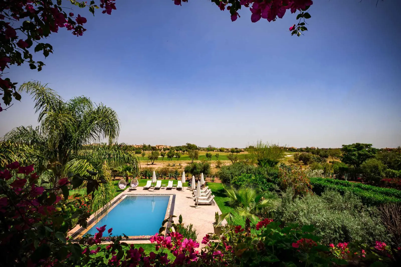
The pool and gardens, the shot the booking decision turns on
The brief
A luxury villa rental in Marrakech needing a brand and web presence that could convey the property’s setting to guests booking from abroad, sight unseen, before they ever set foot in Morocco.
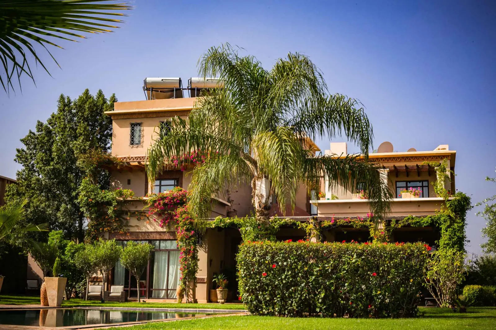
The villa from the drive
The build
A Moroccan-inspired identity built on an earth-tone palette of blues and greens reflecting the villa’s traditional architecture and surroundings, paired with typography that balances traditional character against modern legibility, and pattern work drawn from genuine Moroccan motifs instead of a generic “exotic” visual shorthand. Photography of the property itself grounded the brand in reality.
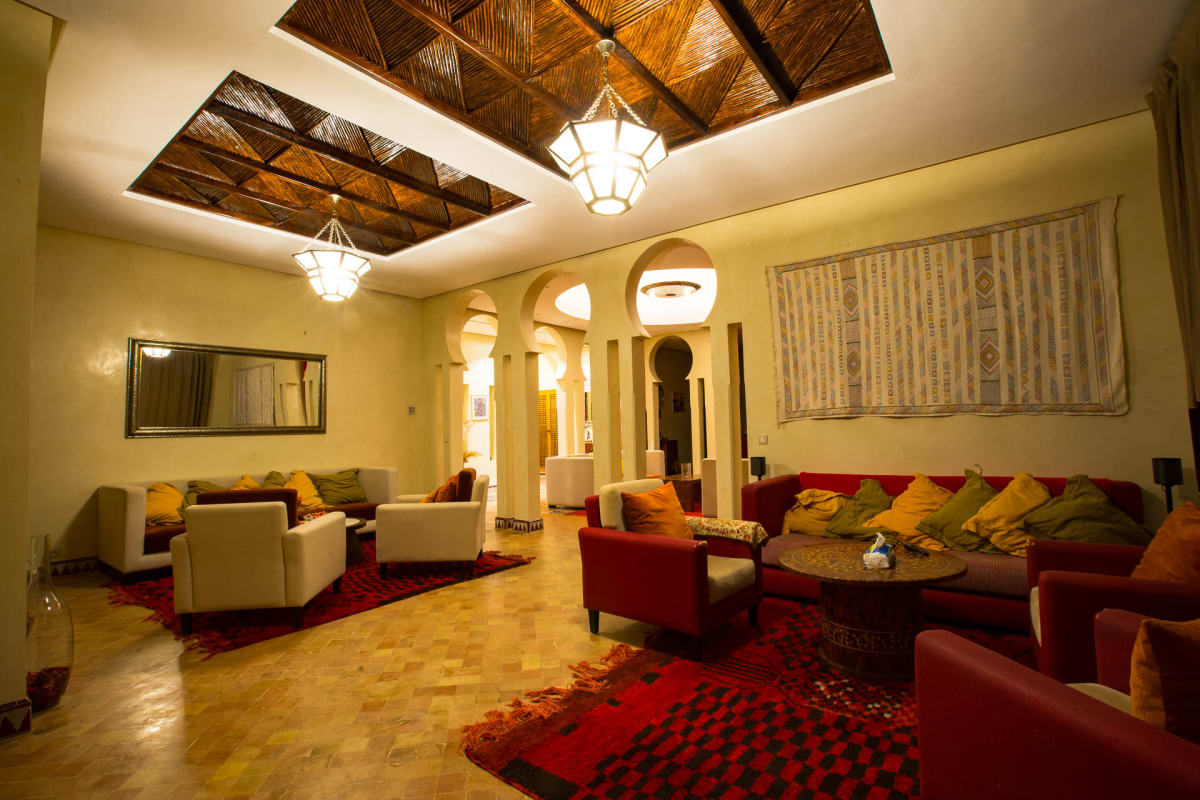
The Al Jannah mark, set for a luxury rental listingThe main lounge under its carved cedar ceiling
The result
A cohesive holiday-rental brand that lets prospective guests picture the villa and its setting before they commit to booking.
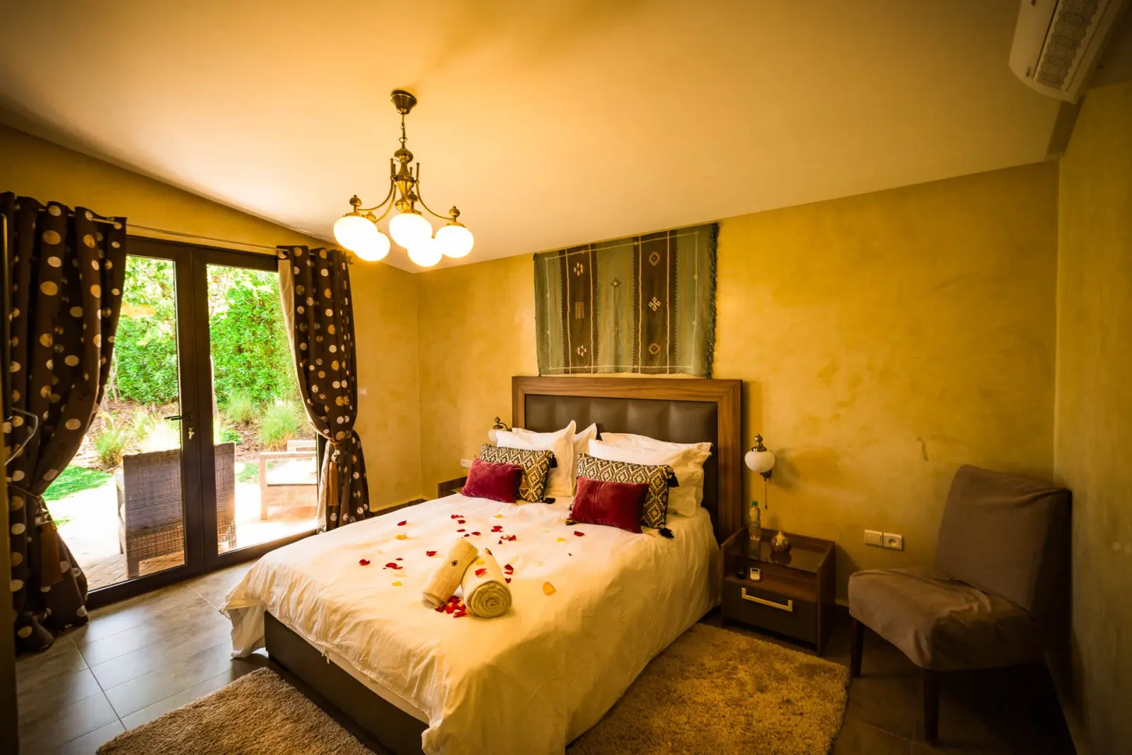
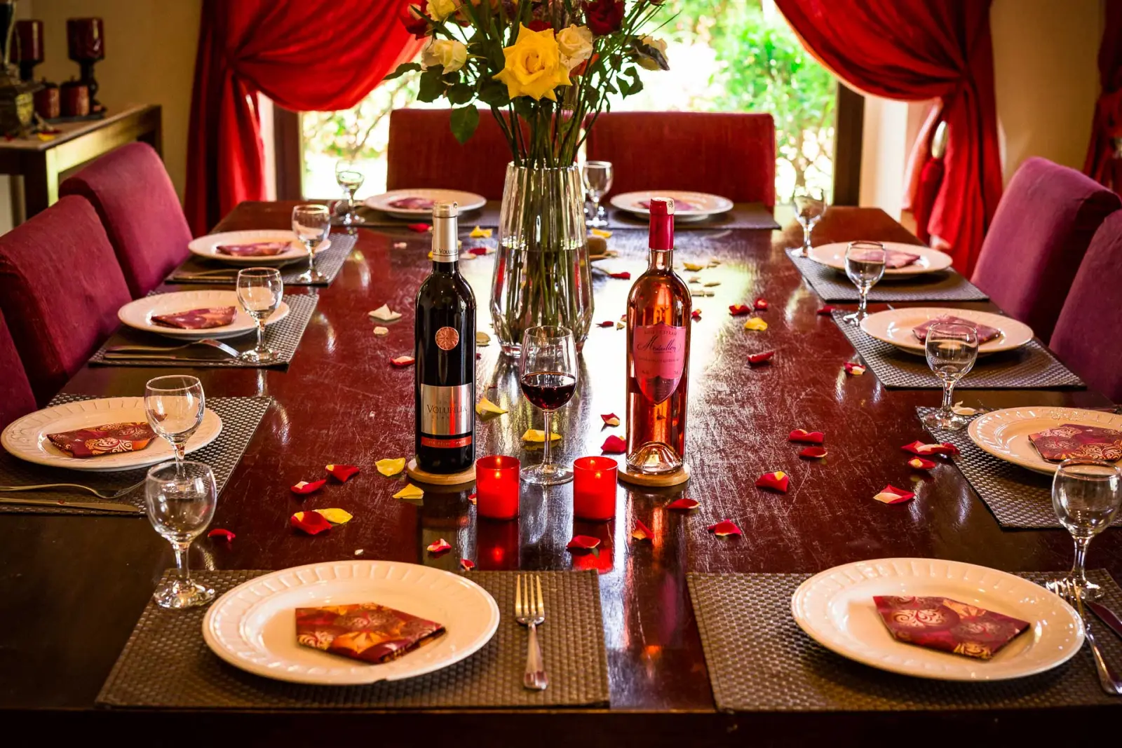
A bedroom dressed for arrivalThe table laid for a private dinner
Want a hospitality brand that sells the real place?
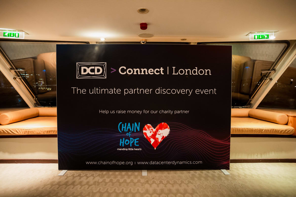
A data centre industry conference held at Westminster Plaza in London, bringing together industry leaders and decision-makers from around the world. The digital presence and the on-the-ground documentation both needed to match the calibre of the audience attending.
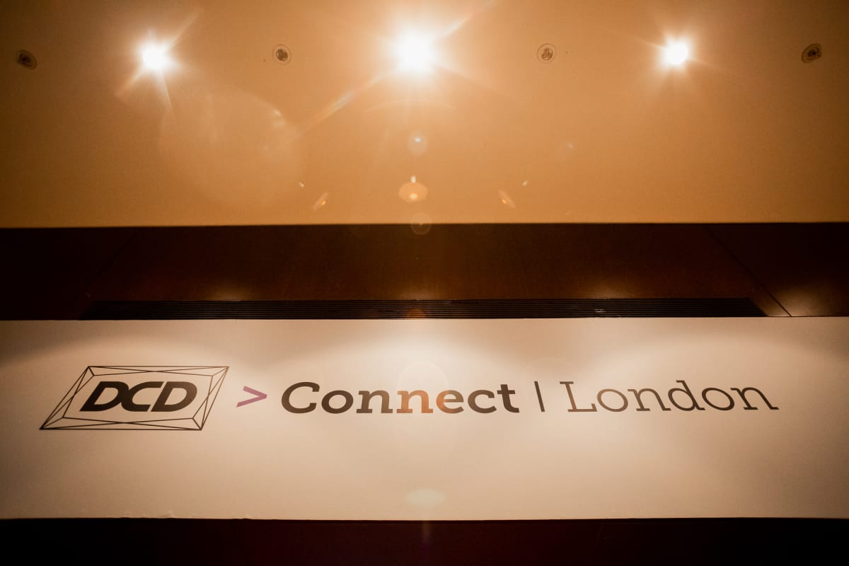
Wayfinding at the entrance, the first thing delegates meet
The build
Web development to support the event’s online presence, alongside event photography and content capturing the conference as it happened, the sessions, the networking and the announcements, instead of a handful of generic crowd shots. The goal throughout was documentation genuinely useful to the client afterwards, for recapping the event and marketing the next one.
Stage graphics behind a DCD Connect Live speakerDelegates moving between stands
The result
A digital and visual record good enough to stand alongside the reputation of the companies who attended.
The climate neutral data centre panel, one of the sessions the branding had to carryThe Chain of Hope backdrop for the evening
Running an event that needs the web presence and coverage to match?
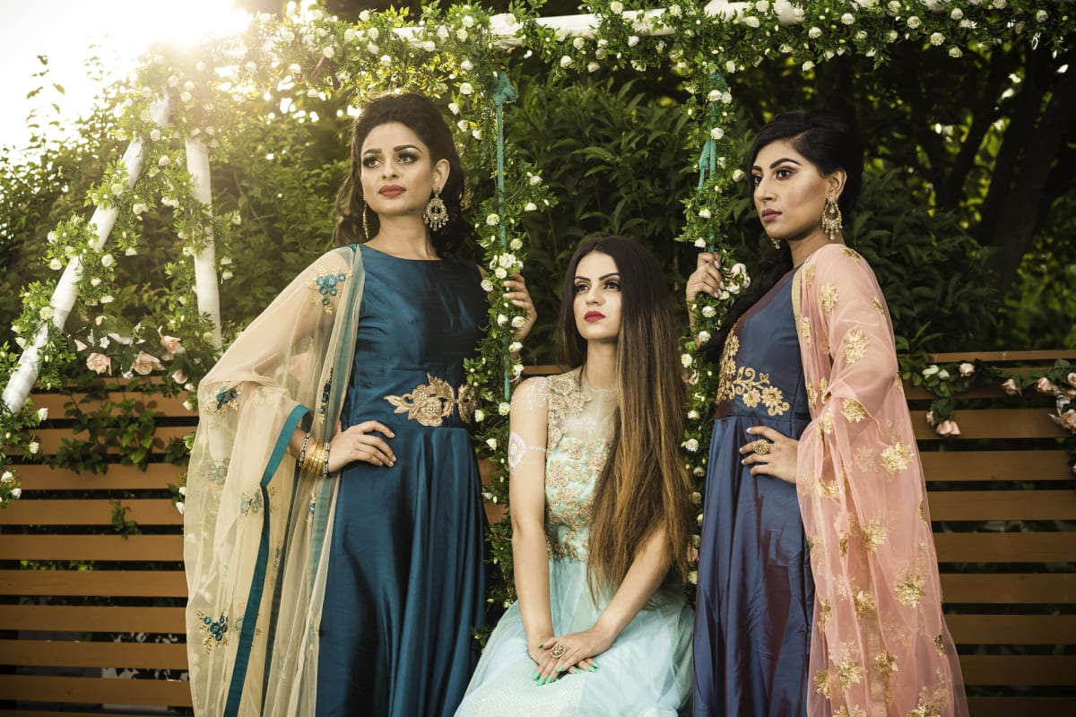
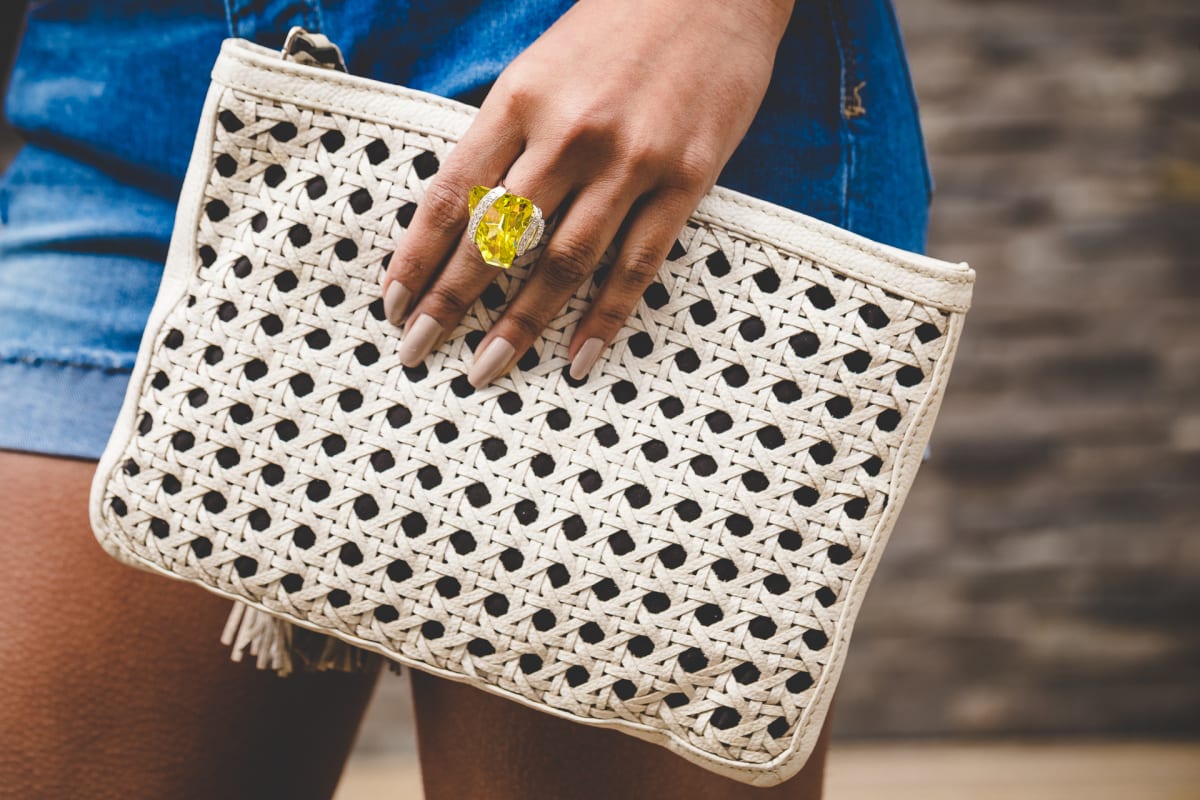
Occasion wear shot as a group, the range in one frame
The brief
A luxury fashion retailer whose footwear, jewellery and accessories deserved photography matching the quality of the product, not the flat, inconsistent images most small fashion retailers end up with.
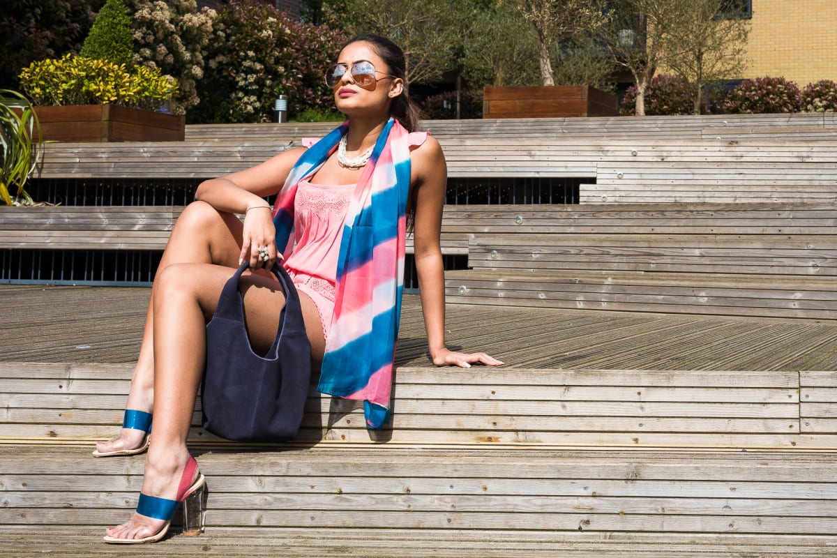
On location rather than in a studio
The build
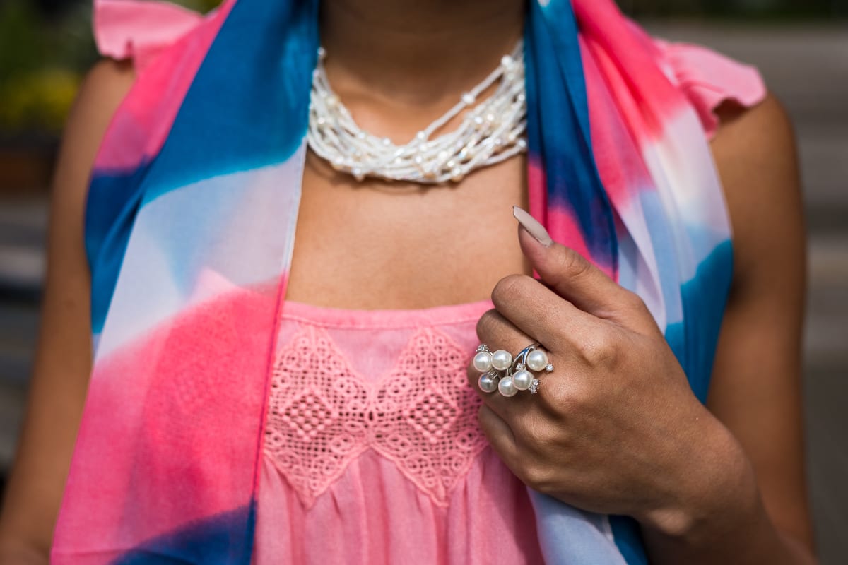
A dedicated fashion photography shoot styled and lit specifically for luxury product: footwear, jewellery and accessories captured to convey the material quality and craftsmanship a customer cannot feel through a screen.
Scarf and jewellery styled as one lookAccessories shot close, where the finish shows
The result
Product photography that does the selling stock imagery cannot, letting the product’s own quality carry the brand, for a retailer trading in London.
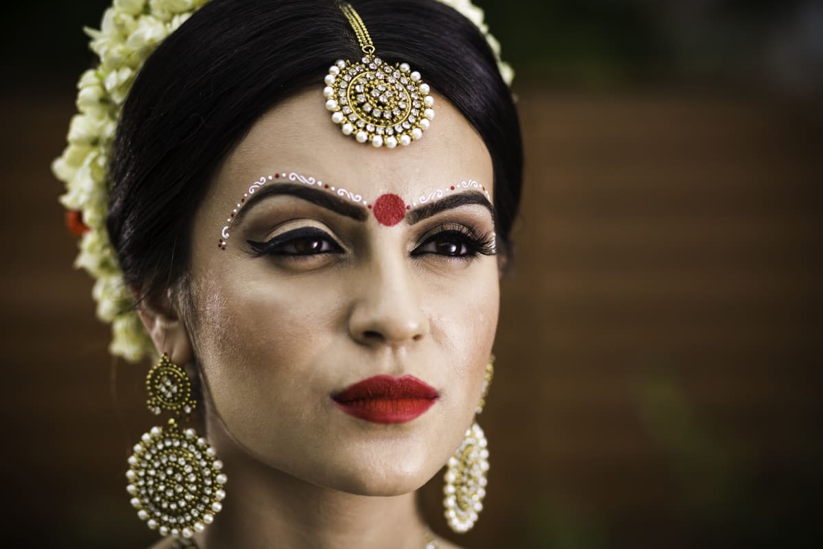
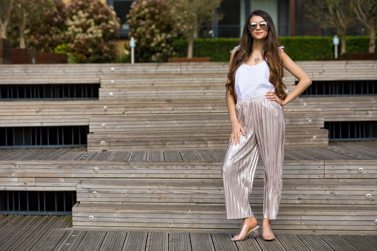
Bridal beauty, lit for the detail in the goldThe pleated look, full length
Want product photography that sells the quality you have built?
We use cookies to ensure that we give you the best experience on our website. If you continue to use this site we will assume that you are happy with it. Privacy policy