Protech Autocentres: Brand Identity for a Vehicle Service Centre
The livery concept: a trust mark, not a motorsport decal
The brief
A vehicle service centre needing a brand and website professional enough to build trust with customers handing over their car for work they cannot see happening.
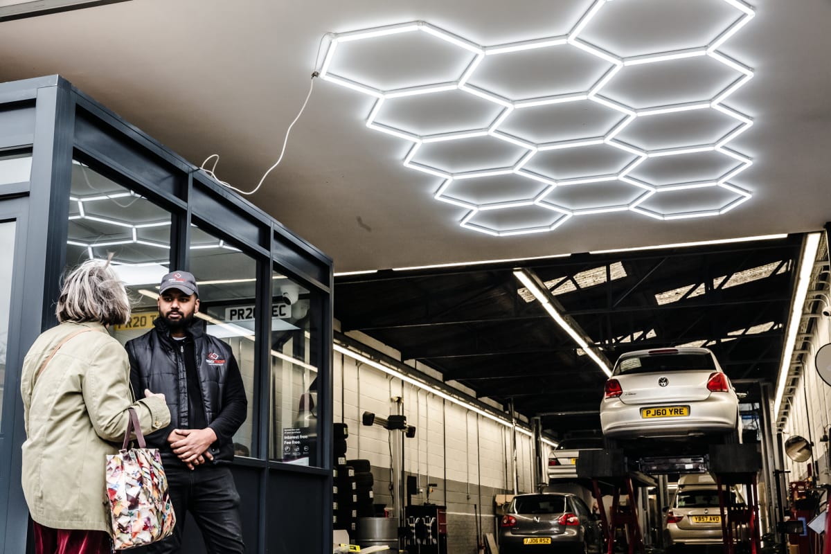
The Protech workshop on the day of the shoot
The build
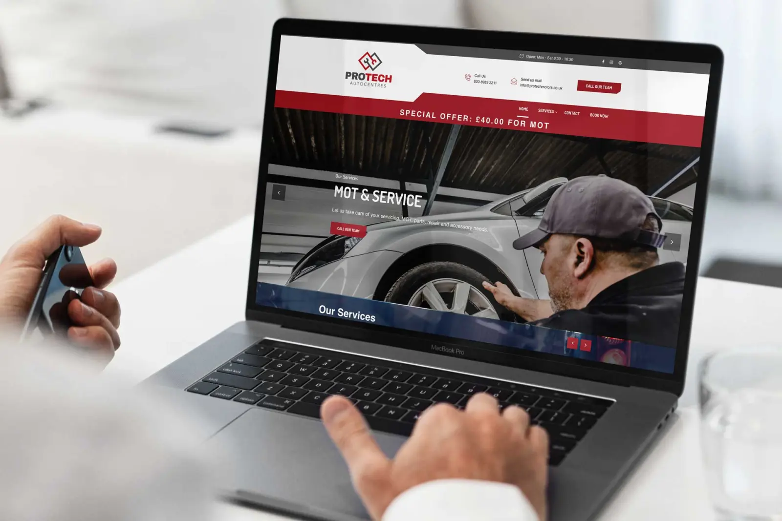
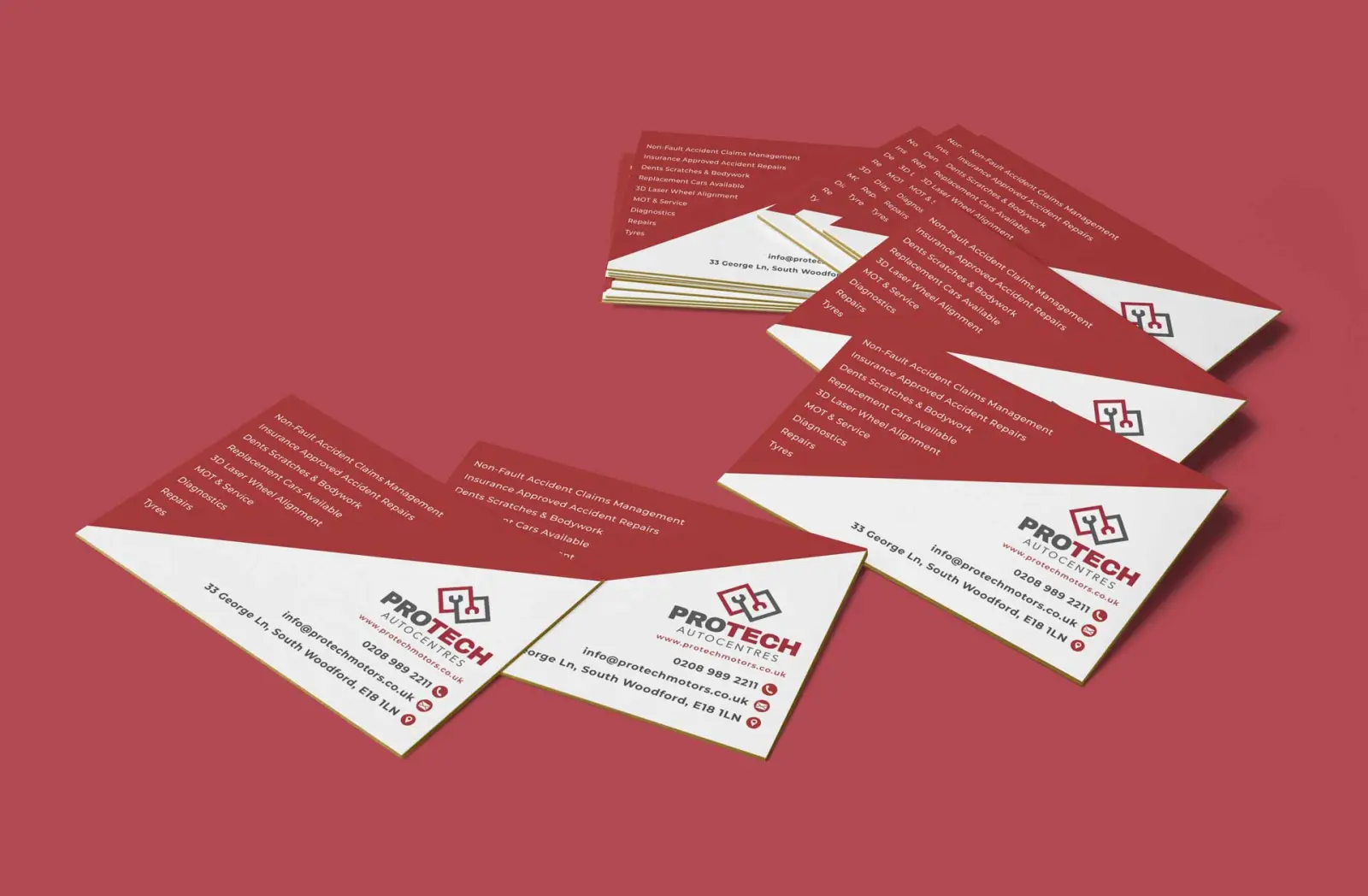
A clean logo and identity built around clarity and trust in place of motorsport cliche, carried consistently through business cards and a website structured around the services on offer, so a visitor can see exactly what the centre does before picking up the phone.
The spanner and ramp mark locked up on the redThe site built around booking an MOT or a service
The result
A consistent, professional identity across the touchpoints customers judge a garage on before they book anything in.
Business cards carrying the same red, grey and whiteCustomers in the workshop under the hex lighting
Want a trade brand that earns trust before a customer walks in?
High Five Family Fitness: Local Fitness Brand & Booking Site
The High Five mark: a hand, five fingers, nothing more
The brief
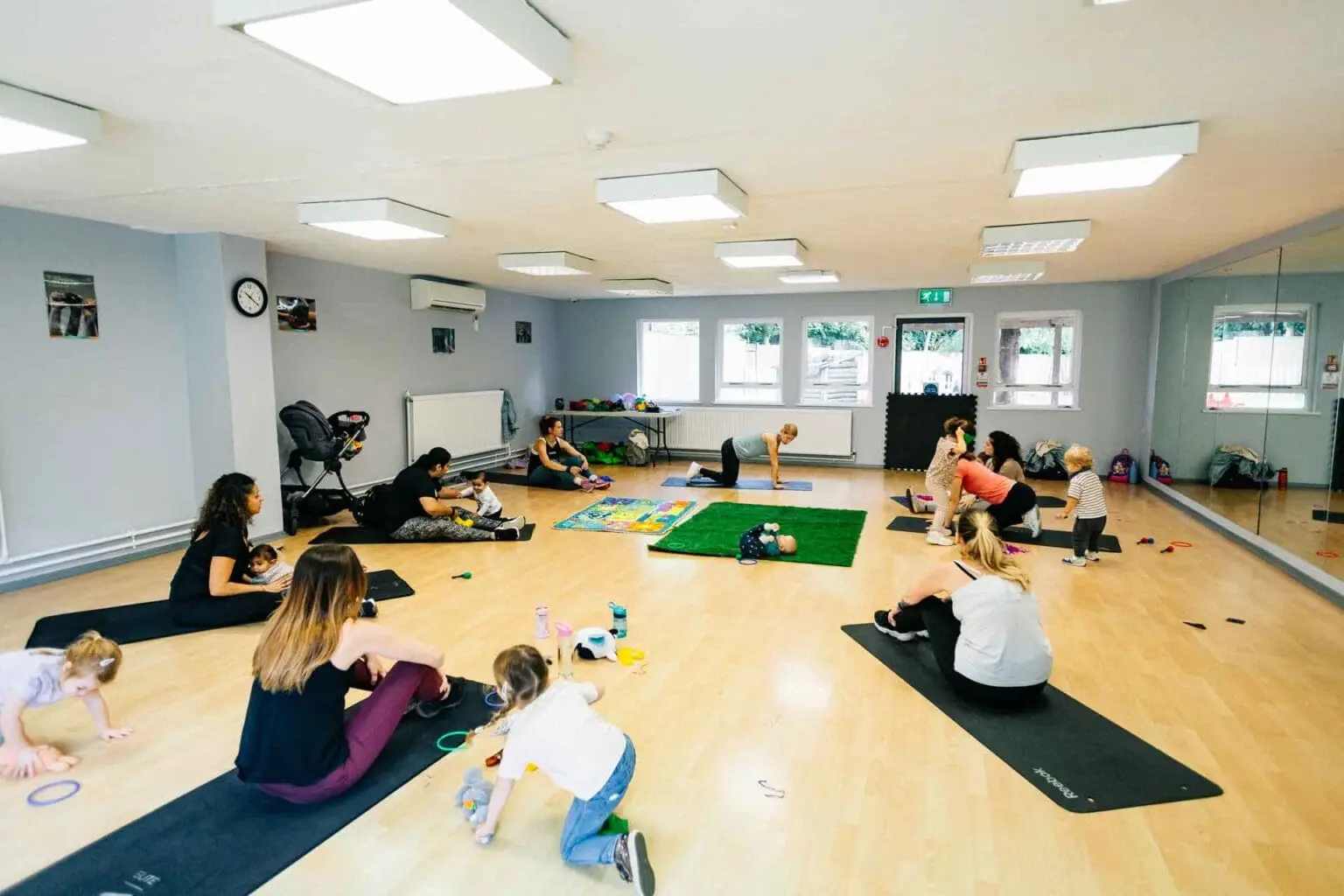
A Watford family fitness class, sessions blending exercise with music and movement for parents and children together, held at the YMCA in Leavesden Country Park, needed a brand and booking system that matched the energy of the classes.
A class at YMCA Leavesden Country Park
The build
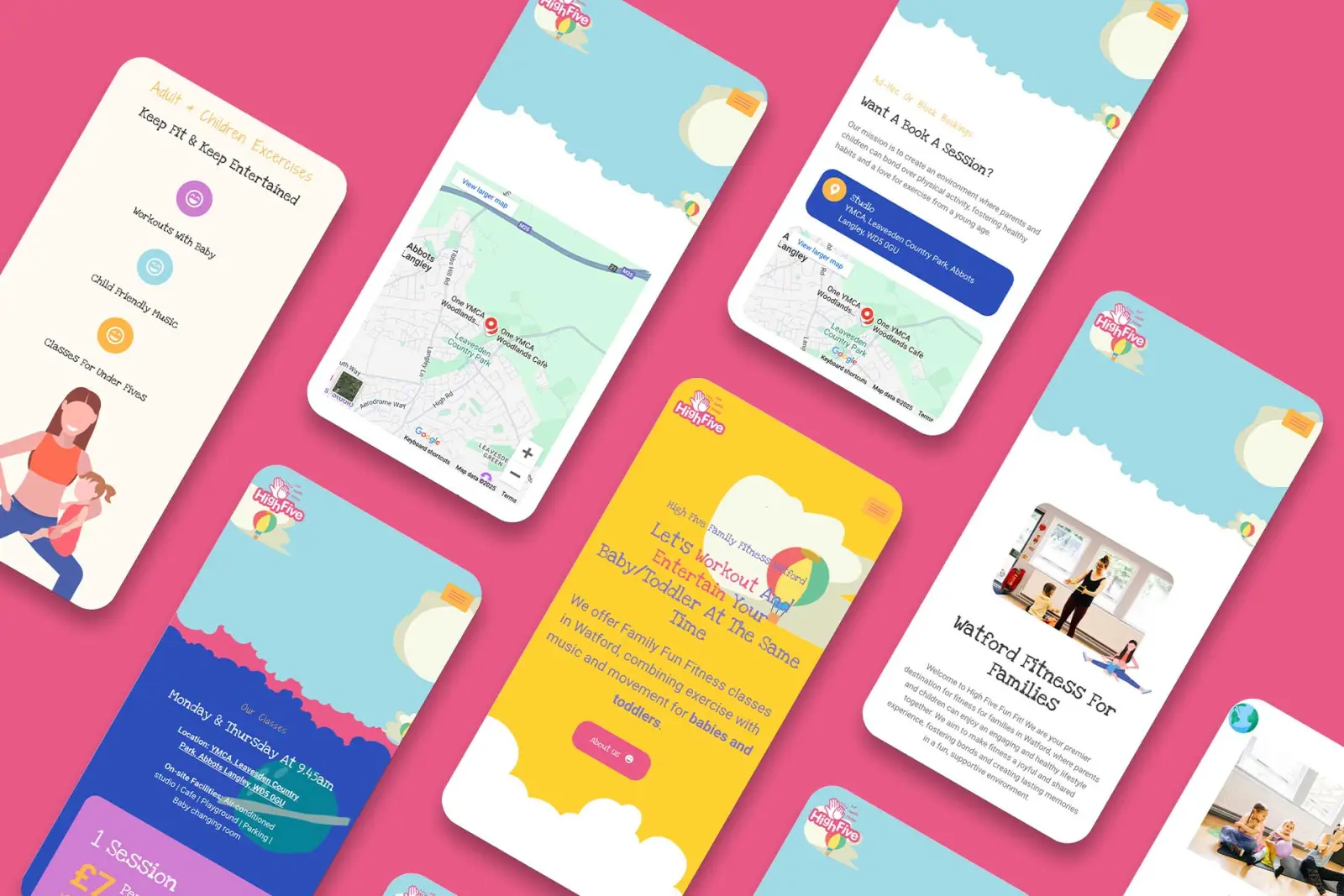
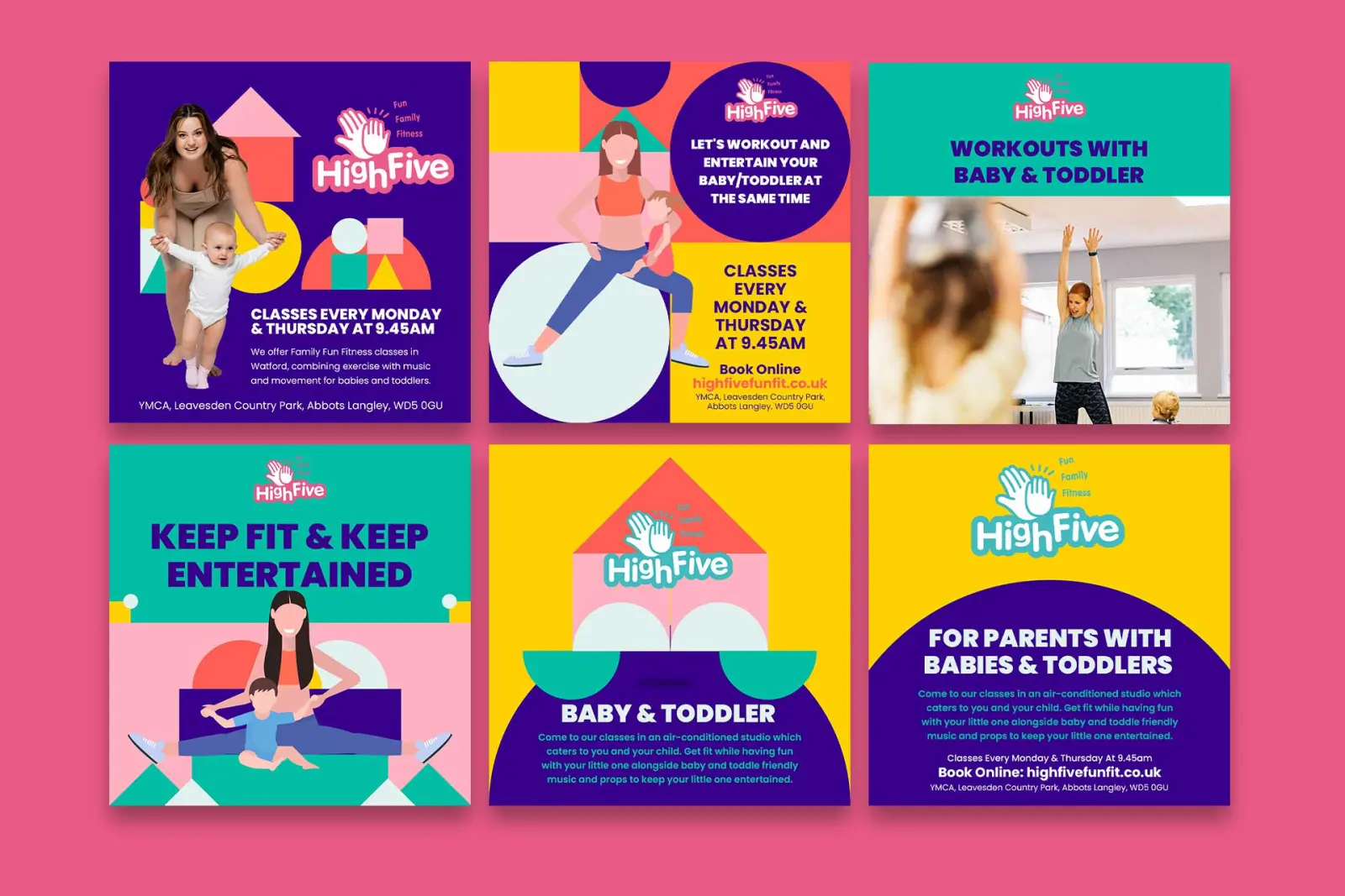
A playful, energetic identity built around fun and family togetherness in place of the serious, clinical tone most fitness brands default to, carried consistently across the site, promotional materials and social media. The site itself centres on an interactive booking system so families can register and manage their own class schedule directly, alongside local SEO work targeting exactly the kind of search a parent nearby would type in.
The booking flow as it appears on a phoneSocial templates built so they can be filled in in-house
The result
A brand and booking experience that takes a specific local audience, families in and around Watford looking for something to do together, from a search result to a booked class with as little friction as possible.
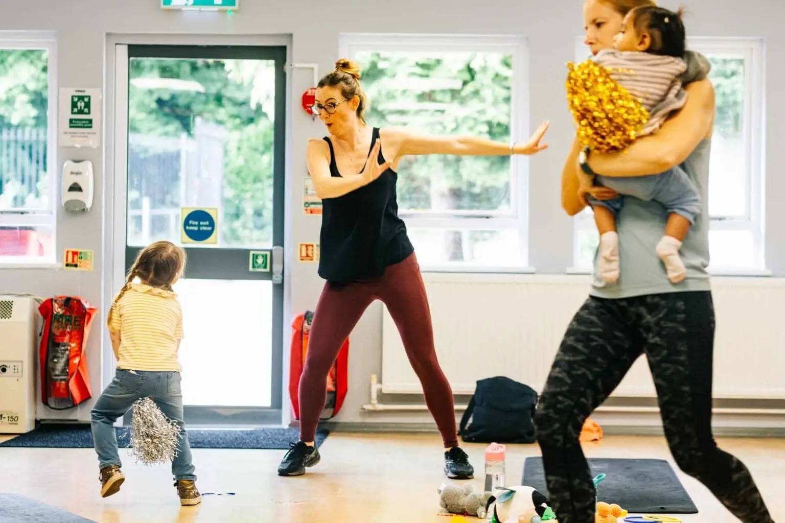
Mum and baby mid-class, the shot the site leads withThe end of a session, which is what the brand is selling
The Hollybush Bar & Restaurant: Brand Identity & Photography
The Hollybush lockup on the house red
The brief
A well-established local bar and restaurant with genuine regulars, and a brand that no longer matched how the venue felt in person. The photography, the menus and the visual identity were doing nothing to bring in anyone who had not already been recommended it by word of mouth.
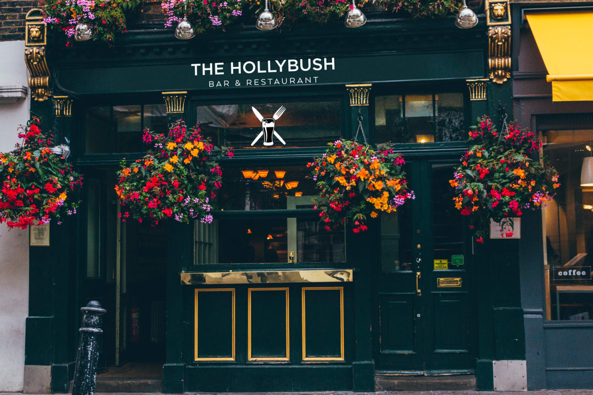
The pub as it stands, flowers and all
The build
Identity work and photography built around the same thing: heritage and quality, never a generic “trendy bar” look that could belong to any venue on any high street. That meant shooting the space and the food the way regulars would describe it, then carrying that tone through the logo, menus and print materials, so a first-time visitor’s expectations match what they get when they walk in.
The mark: knife, fork and a pint glassThe cutlery mark on its own, for small sizes
The result
A brand that reads as established instead of newly rebranded. The goal was never to reinvent The Hollybush, it was to make sure everything printed and photographed looked like the venue people already loved.
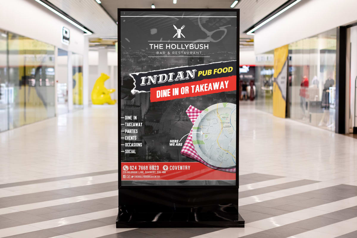
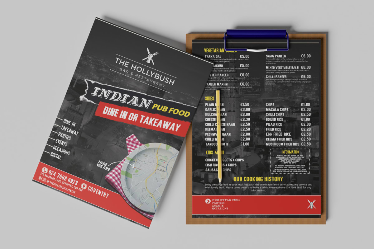
A digital totem promoting the Indian pub food menuLeaflets and the menu clipboard used in the bar
Should your photography and identity match your venue?
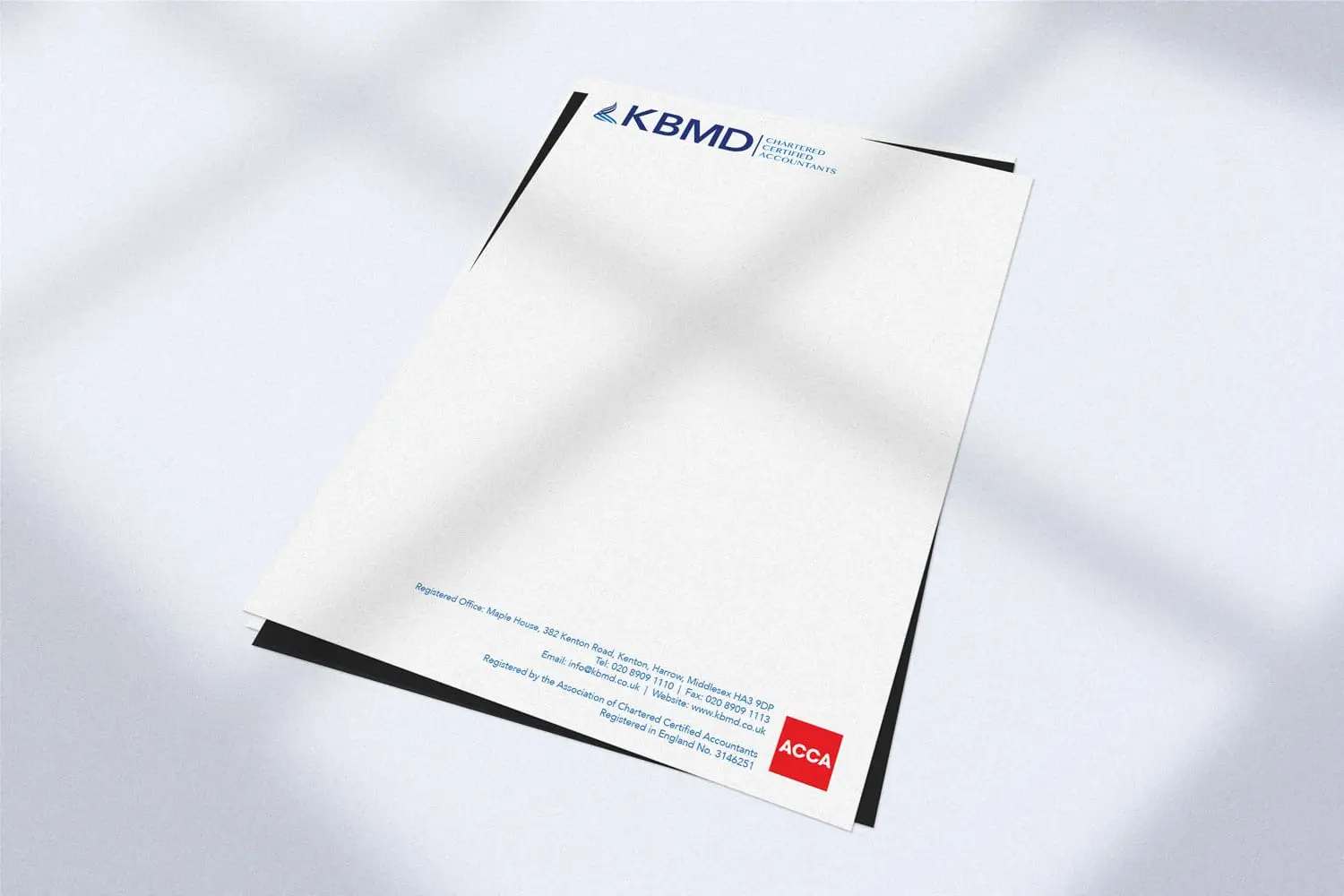
An accountancy practice needing an identity that reads as established and trustworthy the moment a prospective client sees it: in a sector where the wrong logo can quietly undercut credibility before a conversation even starts.
The mark on the lighter blue, for screen use
The build
A clean, structured mark designed to hold up on everything from a business card to a formal report cover: precise instead of decorative, since a firm handling other people’s finances benefits from a logo that looks competent and does not date quickly.
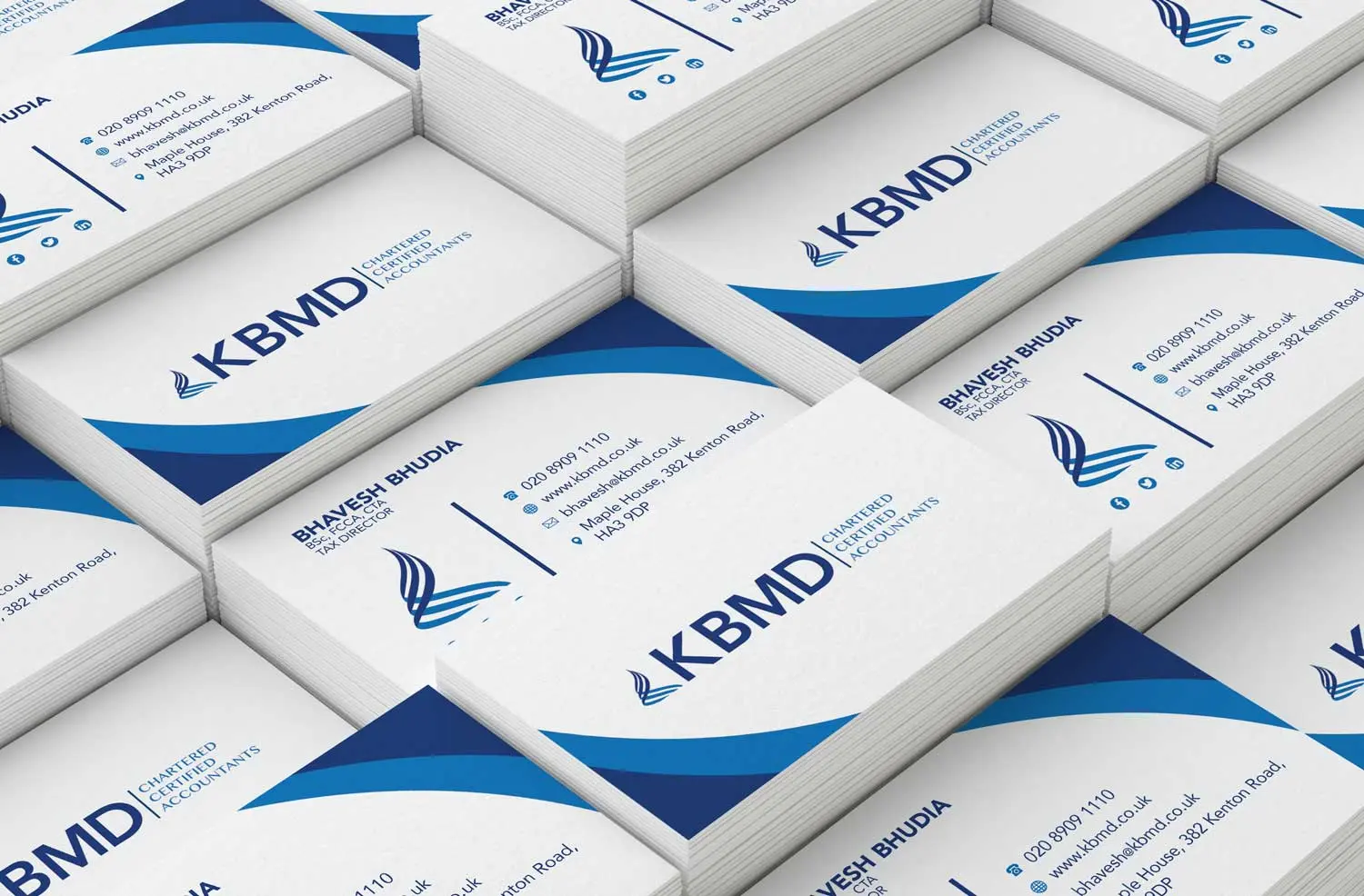
The mark on its own, at the size a business card gives itBusiness cards for the practice
The result
An identity that fits the expectations of an accountancy client: professional, understated, and consistent across every piece of stationery it needed to appear on.
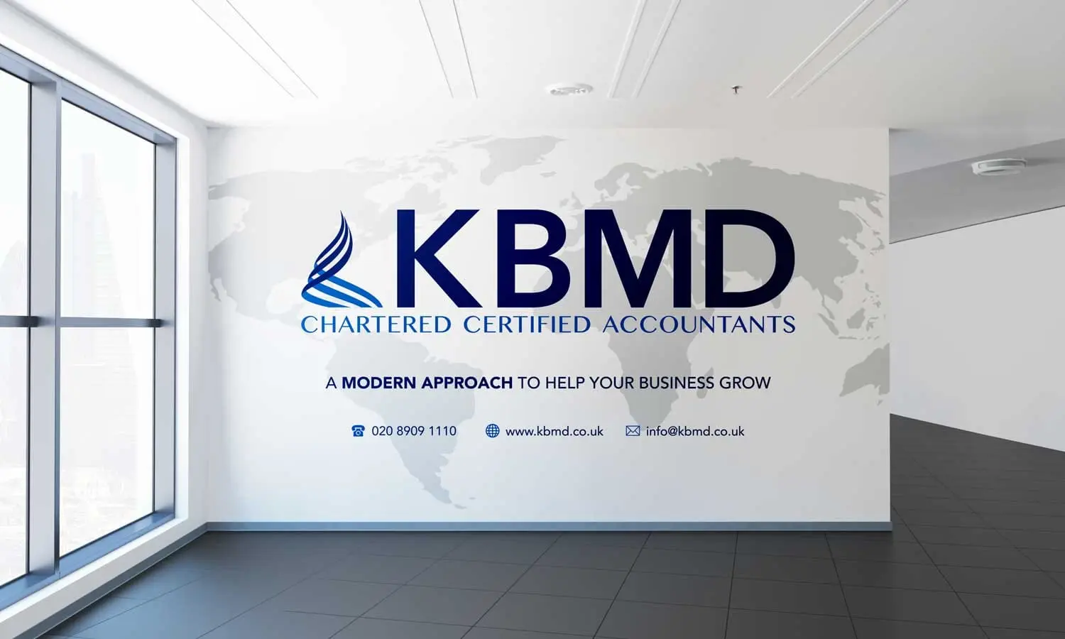
Reception signage at the KBMD officeLetterhead, where the restraint matters most
Want an identity that reads as trustworthy at first glance?
Takes two minutes. Usually ready within a few working days.
We use cookies to ensure that we give you the best experience on our website. If you continue to use this site we will assume that you are happy with it. Privacy policy