Vijay’s Virasat: Brand Identity for a Three-Generation Restaurant
The finished Vijay's Virasat lockup
The brief
A restaurant with a genuinely rare story: starting as Vijay’s Sweet Mart, growing into Vijay’s Chawalla’s street food, and now Vijay’s Virasat’s full vegetarian and non-vegetarian menu, spanning three generations of the same family. The brand needed to carry that real history, not invent a generic “authentic Indian cuisine” story from scratch.
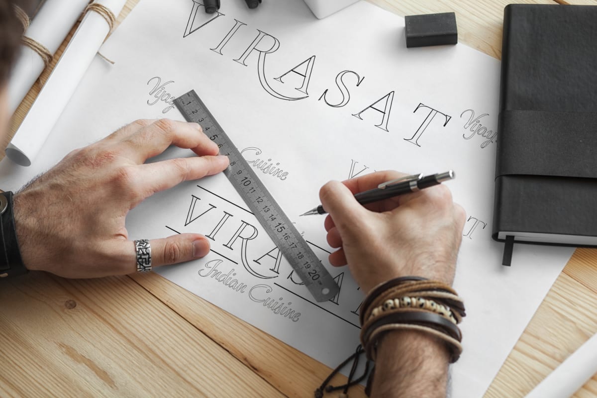
The mark drawn by hand before it went near a screen
The build
A logo drawing on traditional Indian motifs, paisley patterns and mandala forms, built with lines clean enough to stay legible across menus, signage and packaging instead of becoming an ornate mark that falls apart at small sizes. The colour palette (saffron, deep green, terracotta) evokes spice markets and traditional dining without tipping into cliche, paired with a serif and sans typography pairing that balances heritage against everyday readability on a takeaway menu.
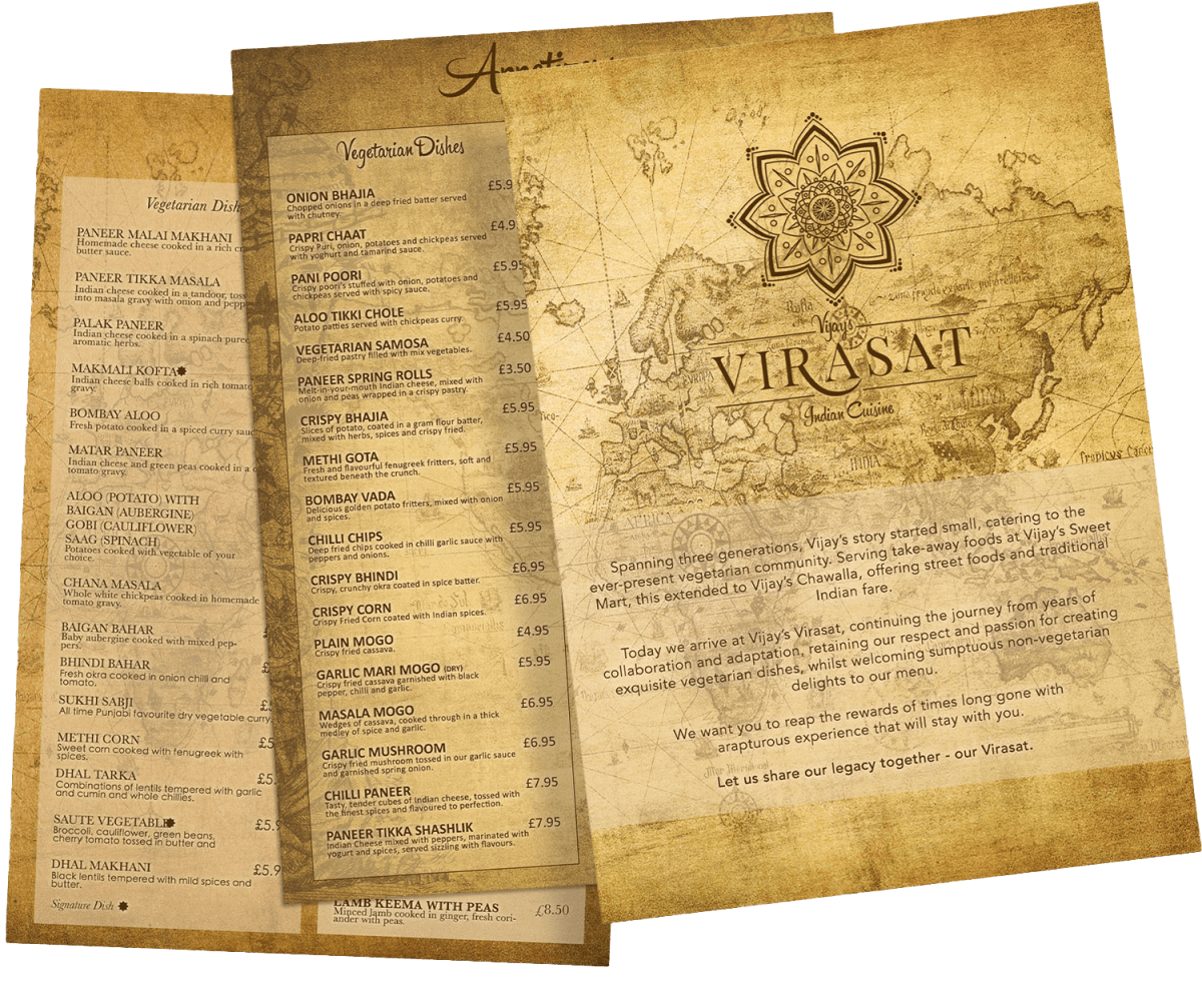
Mandala and paisley forms reduced to lines that hold at small sizesMenus printed on aged map stock, where the identity works hardest
The result
A brand identity that carries the weight of three generations of family history, positioning Vijay’s Virasat as a cultural anchor for the community it serves.
We are glad to have chosen Terence when branding our restaurant. From the moment we set the brief, his dedication was remarkable in order to meet tight deadlines.
For Branding a new business or updating your company brand, Terence is the man!
V Virasat (Google review)
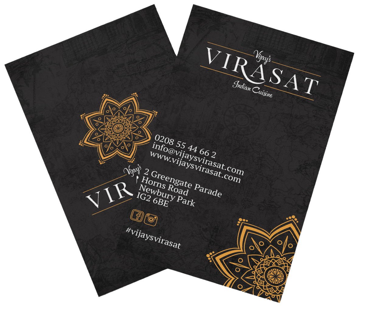
Business cards in saffron, deep green and terracottaFood photographed for the same set of materials
Tulsi Vagjiani: Personal Brand Identity for a Motivational Speaker
The Tulsi Vagjiani wordmark in gold
The brief
A personal brand for a motivational speaker and plane-crash survivor whose story needed an identity that could carry its weight without ever tipping into anything exploitative or overly dramatic.
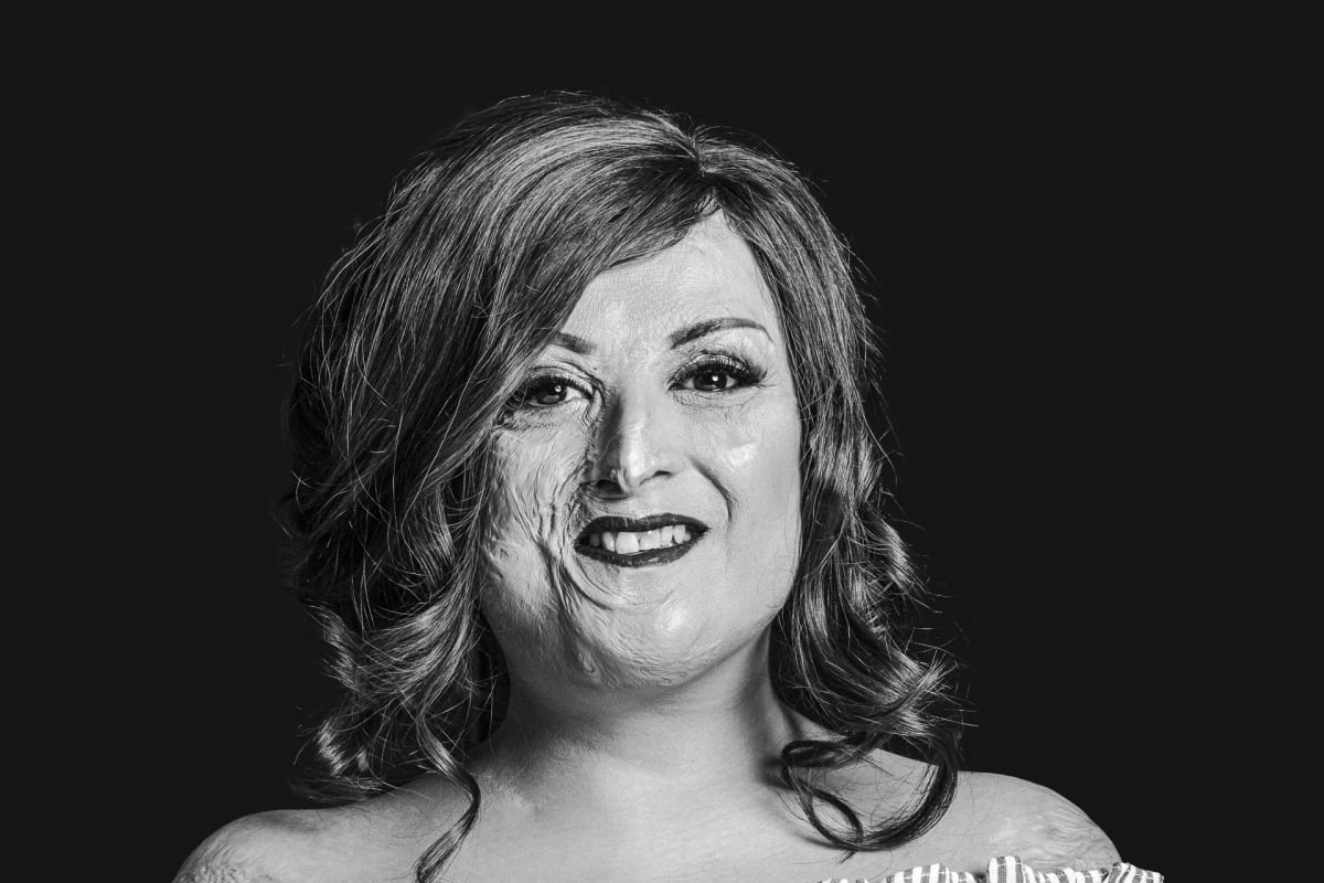
Portrait photography kept plain and direct
The build
A minimalist, luxury-leaning identity: a considered colour palette, refined typography, and a logo built to work as hard on a website as it does across speaking engagements, designed to let the story itself carry the emotional weight instead of a busy or sensationalised visual treatment.
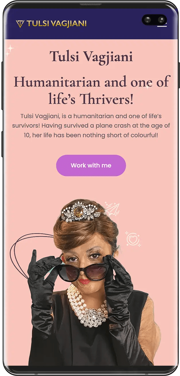
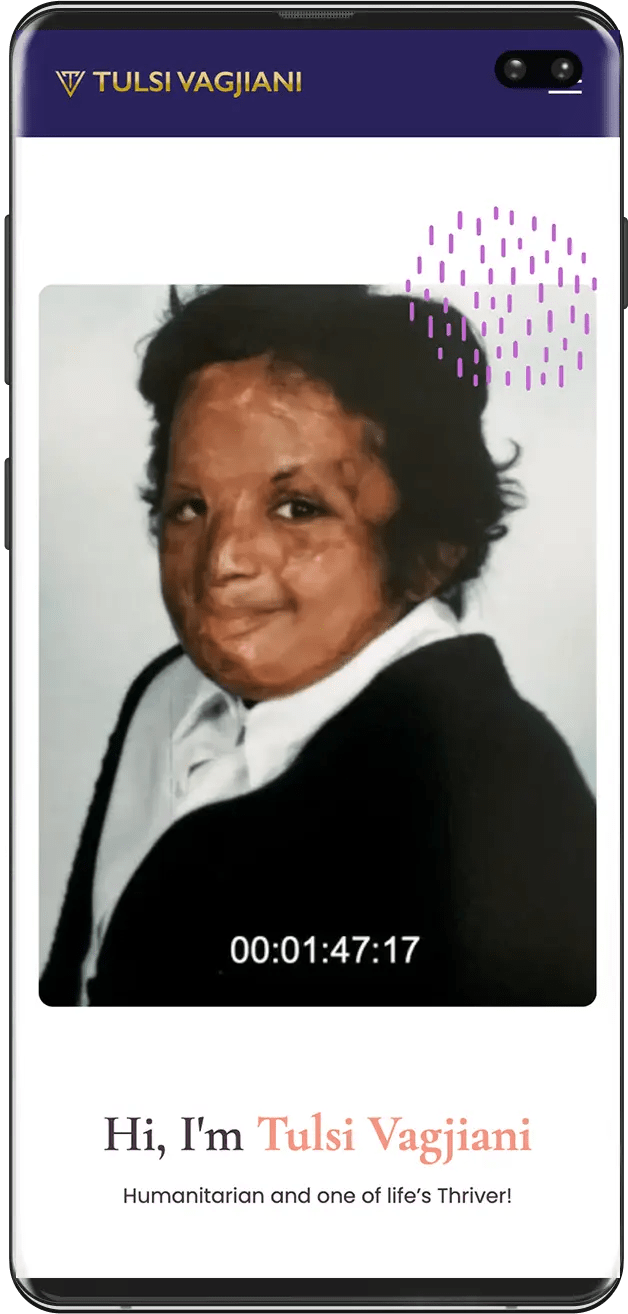
The mobile homepage introducing Tulsi in her own wordsVideo-led hero on the phone, where most of her audience arrives
The result
A personal brand serious and considered enough to match the story behind it, giving Tulsi a consistent identity across her website and speaking platform.
Photography used at full width, never as decorationA styled portrait from the same shoot, used on the speaking pages
Does your personal brand carry your story with the weight it deserves?
Metro Laundrette & Dry Cleaners: Local SEO and Social for a Neighbourhood Business
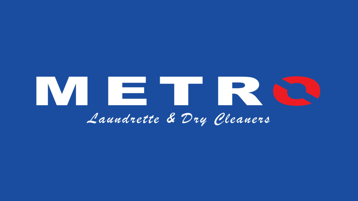
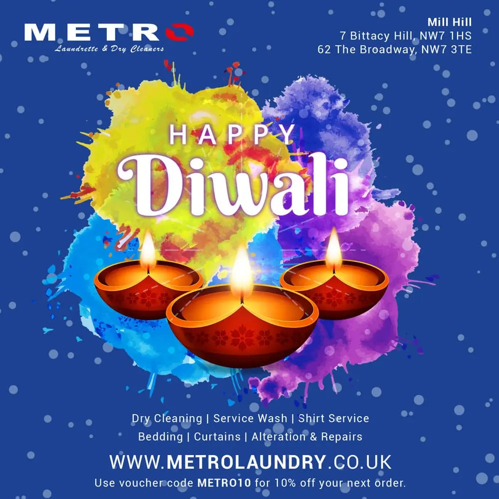
The Metro mark in the blue and red the shopfronts already used
The brief
A laundrette and dry cleaner needing a website and local visibility strategy built around how people search for this kind of service, terms like “laundry service near me” and “eco-friendly dry cleaners”, plus a social presence to stay visible between visits.
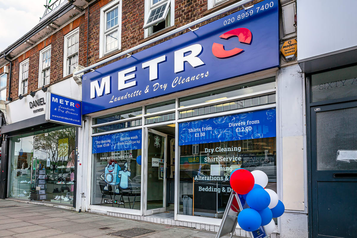
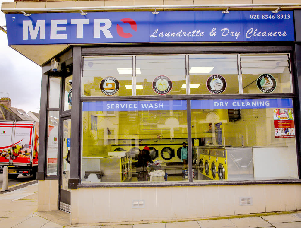
The Mill Hill shop on reopening day
The build
A redesigned website with SEO built around genuine local search terms, backed by a social content calendar and seasonal promotional material, back-to-school offers, loyalty programmes and seasonal posters, designed to keep the business front of mind for a service people do not think about until they need it.
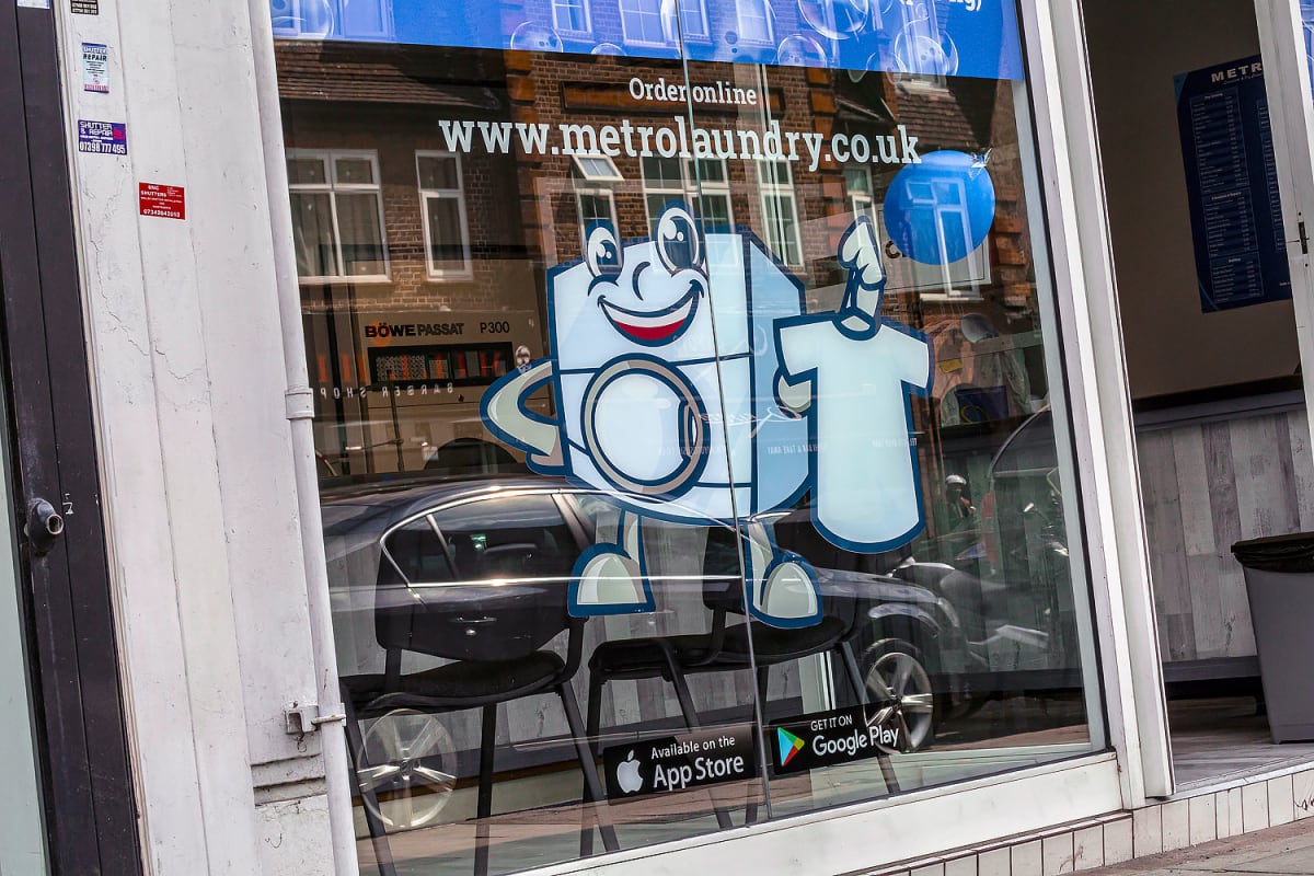
Window graphics carrying the mascot and the web addressOne of the seasonal social posts from the yearly calendar
The result
A Mill Hill business with a website and social presence built around how nearby customers search and decide, and a template for the kind of local work I do across north London.
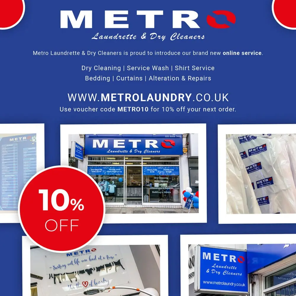
The second branch, same signage systemThe launch post for the online ordering service
Ready to be found by the customers already searching for you?
Al Jannah Villa Marrakech: Brand Identity for a Luxury Villa Rental
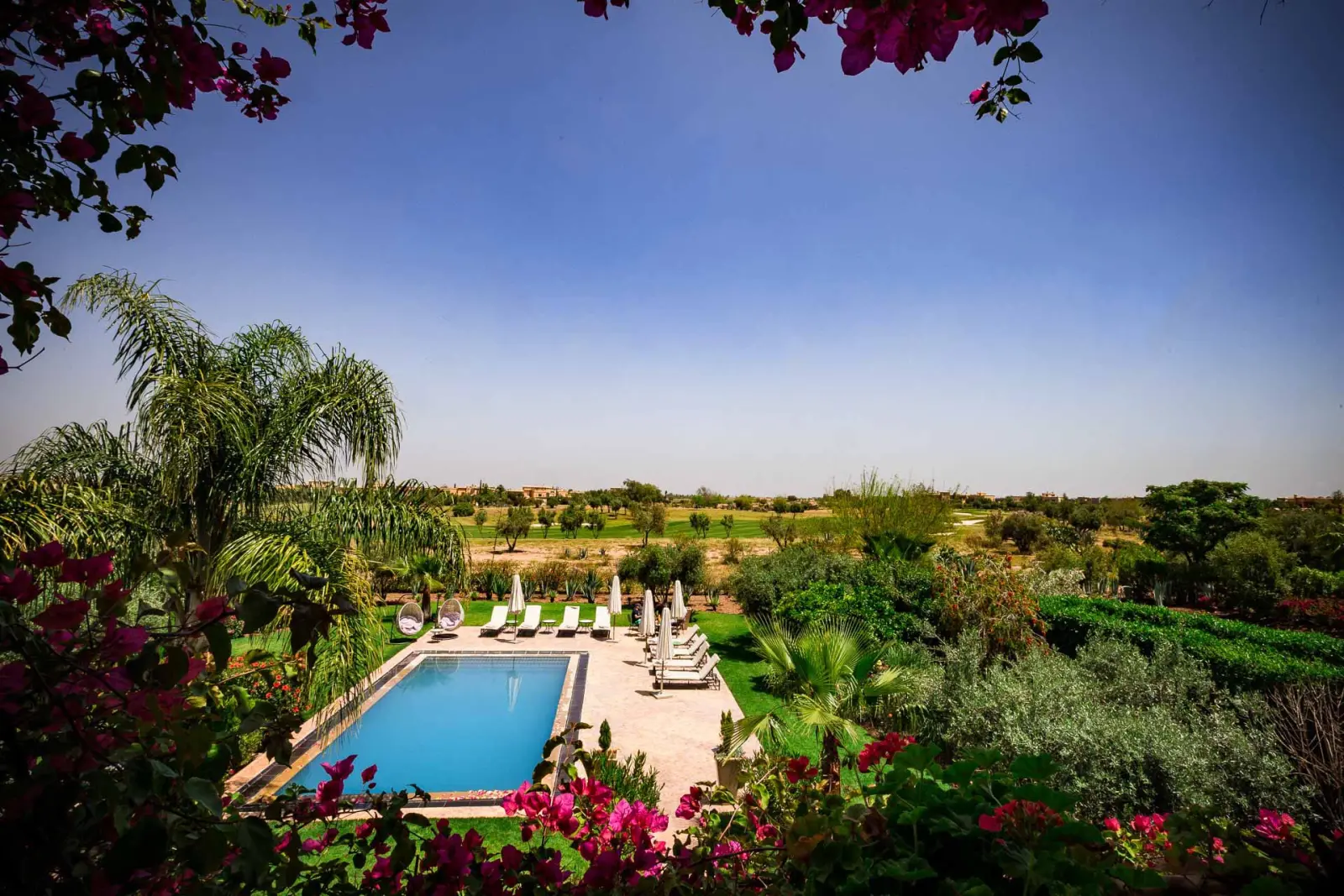
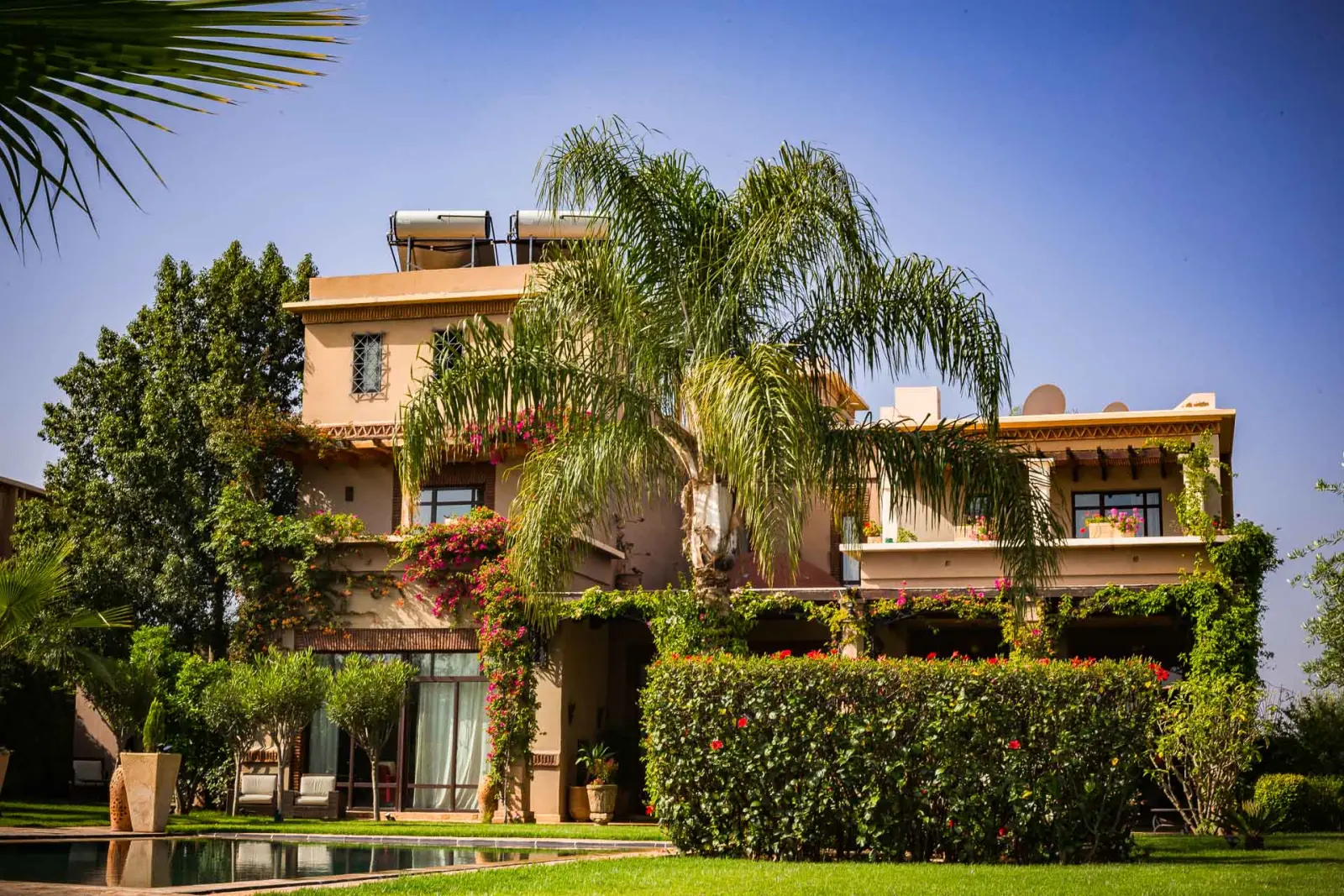
The pool and gardens, the shot the booking decision turns on
The brief
A luxury villa rental in Marrakech needing a brand and web presence that could convey the property’s setting to guests booking from abroad, sight unseen, before they ever set foot in Morocco.
The villa from the drive
The build
A Moroccan-inspired identity built on an earth-tone palette of blues and greens reflecting the villa’s traditional architecture and surroundings, paired with typography that balances traditional character against modern legibility, and pattern work drawn from genuine Moroccan motifs instead of a generic “exotic” visual shorthand. Photography of the property itself grounded the brand in reality.
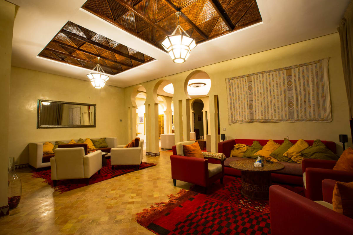
The Al Jannah mark, set for a luxury rental listingThe main lounge under its carved cedar ceiling
The result
A cohesive holiday-rental brand that lets prospective guests picture the villa and its setting before they commit to booking.
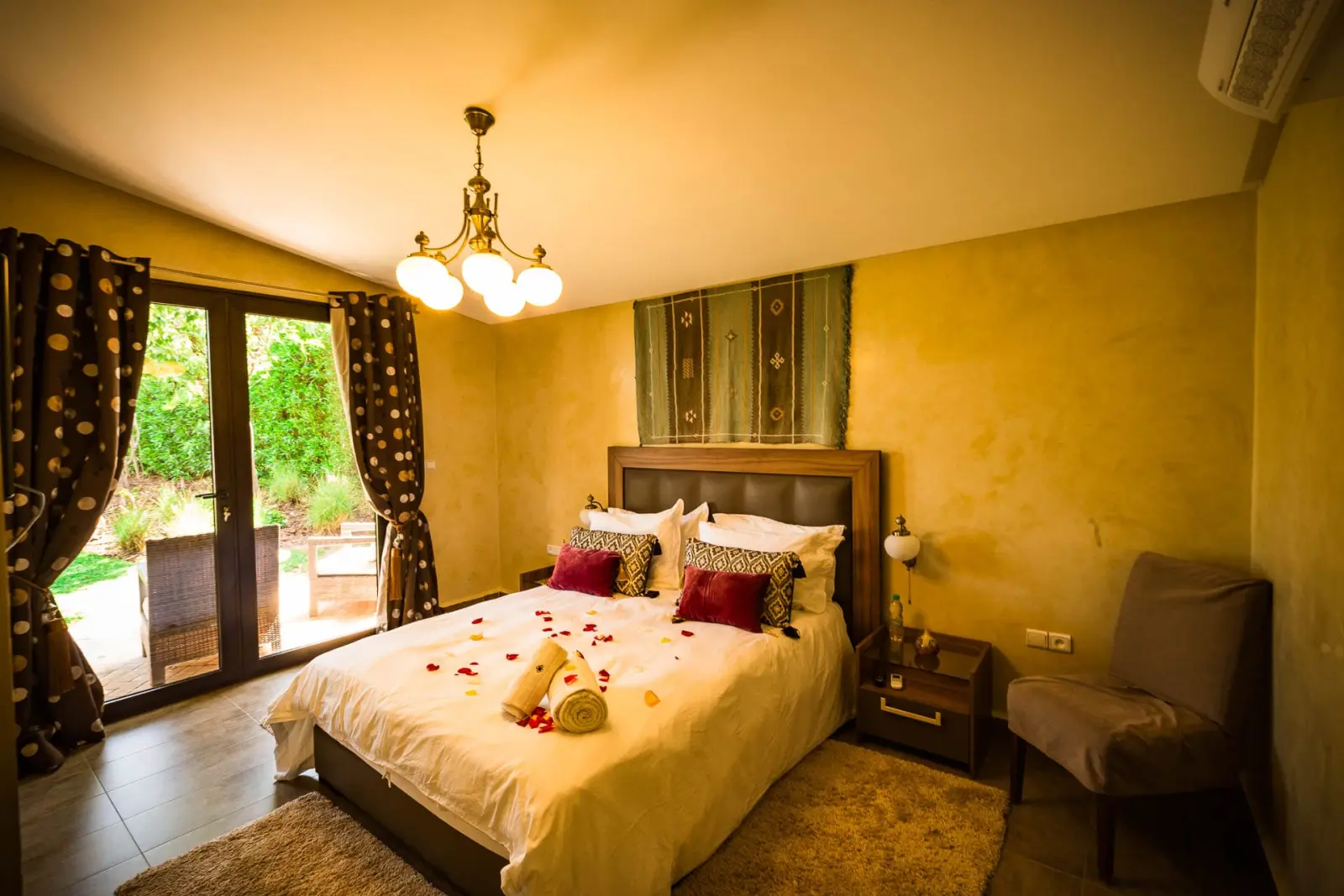
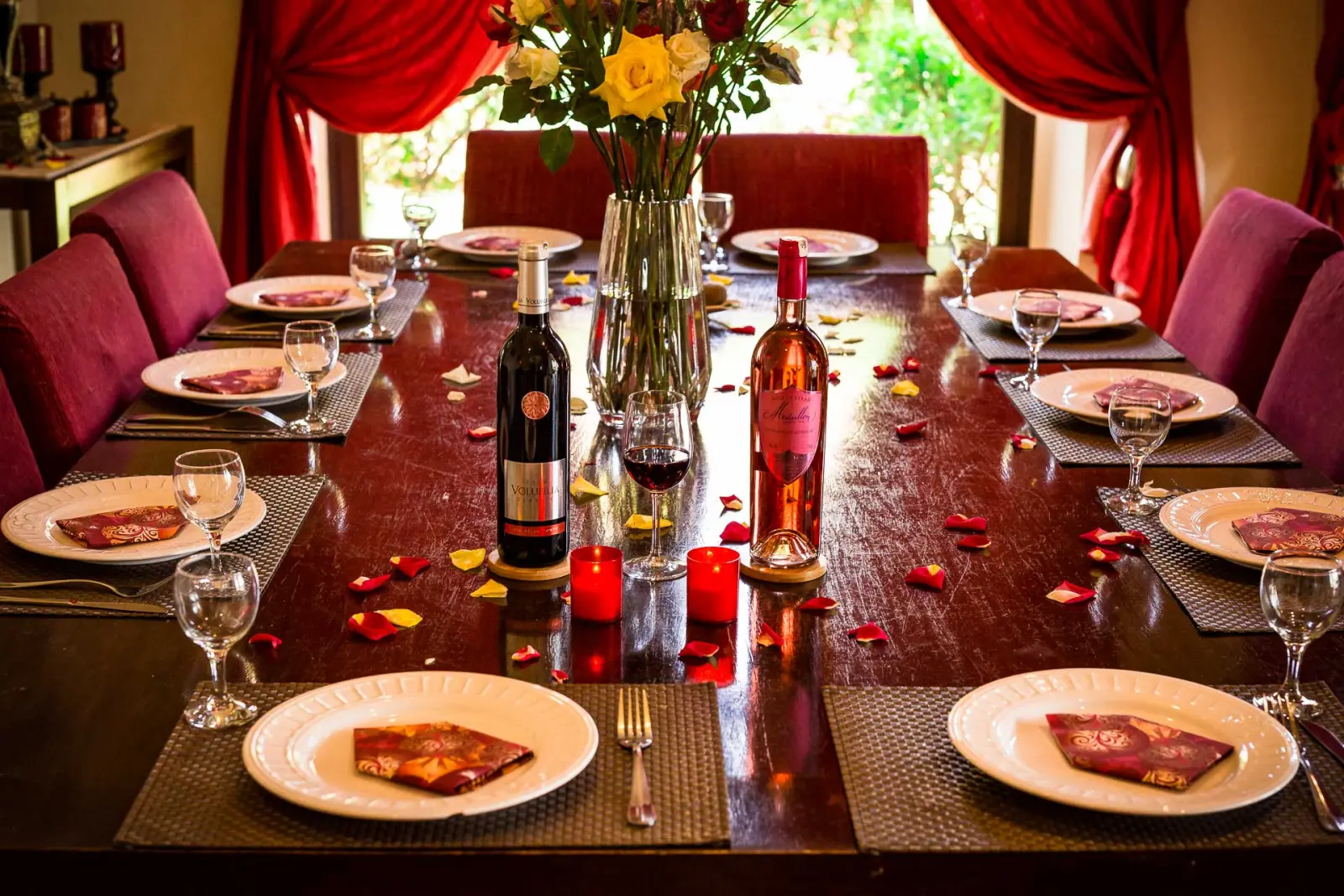
A bedroom dressed for arrivalThe table laid for a private dinner
Want a hospitality brand that sells the real place?
TEDx University of Salford: Full Event Brand Identity
A speaker on the red circle against the TEDx letters
The brief
Every independently-organised TEDx event has the same tension to manage: stay recognisably TED, while still feeling like it belongs to the specific university and city hosting it. Get that balance wrong and the event either feels like a knock-off or loses the credibility the TED name is meant to lend it.
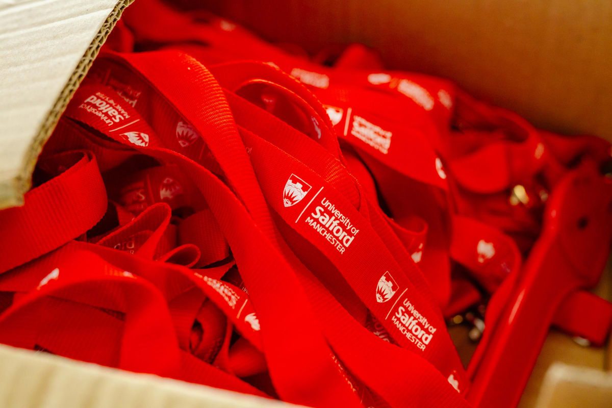
Red lanyards, the one piece of TED a local event keeps
The build
A full identity system built to survive contact with every touchpoint an attendee experiences: stage design, printed stationery, social media graphics and on-the-day signage, all carrying the same visual language instead of a logo applied inconsistently across whoever happened to design each piece. The identity guidelines were treated as a real constraint throughout, not a moodboard nobody referred back to once production started.
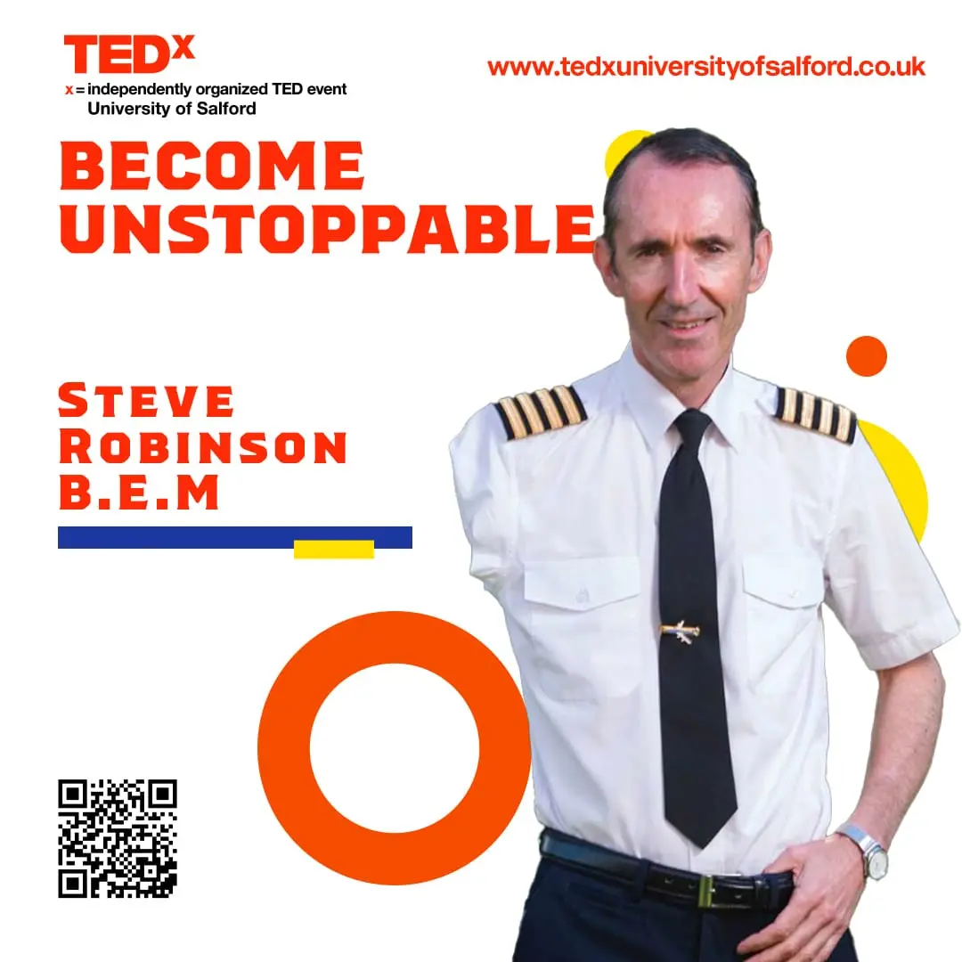
The Become Unstoppable event posterOne of eleven speaker cards, all built from one template
The result
An event that read as professionally produced from the first promotional post through to walking into the venue: the kind of consistency that is easy to describe and genuinely difficult to hold onto once a dozen materials are being produced under deadline.
The stage as the audience saw itA talk in progress at MediaCity
Organising an event that needs a brand to hold together?
Takes two minutes. Usually ready within a few working days.
We use cookies to ensure that we give you the best experience on our website. If you continue to use this site we will assume that you are happy with it. Privacy policy