DDG Windows
Rebrand and identity for a windows and glazing installer.
DDG Windows: Brand Rebrand for a Glazing Installer
The brief
A London windows and glazing installer whose existing brand had aged alongside the business, needing a rebrand that appealed to a younger demographic without losing the trust an established installer had already built.
The build
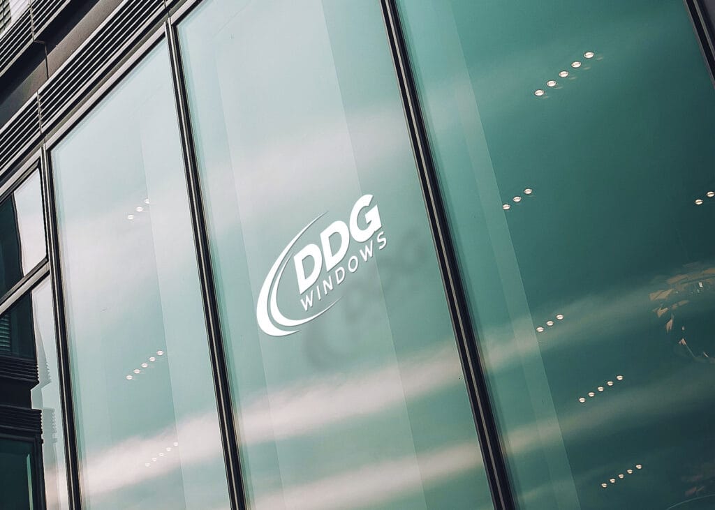
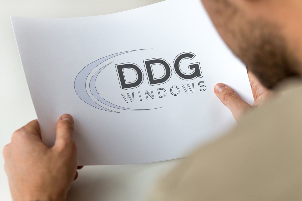
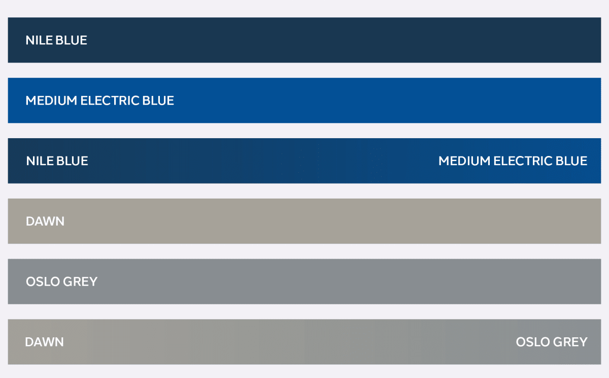
A new identity built around three attributes the business needed to convey: quality craftsmanship, technical innovation and reliability. The mark uses a stylised window shape for clarity and openness, paired with clean modern typography and a blue-and-grey palette chosen for the professionalism and trust it signals in a trade where customers are making a significant, infrequent purchase.
The result
A brand system with guidelines clear enough to stay consistent across every touchpoint the business uses, vehicles, uniforms, print and digital, without each new piece of collateral drifting from the last.
Thinking about a rebrand that keeps the trust you have built?
Got something like this, or nothing like it?
Tell me what you're starting, or what's broken.