Back to work
Case study / Branding
KBMD Chartered Certified Accountants
Identity work for a chartered accountancy practice.
Client KBMD Chartered Certified Accountants
Industry Professional Services
Services Branding
Website kbmd.co.uk
The full story
KBMD Chartered Certified Accountants: Brand Identity
The brief
An accountancy practice needing an identity that reads as established and trustworthy the moment a prospective client sees it: in a sector where the wrong logo can quietly undercut credibility before a conversation even starts.

The build
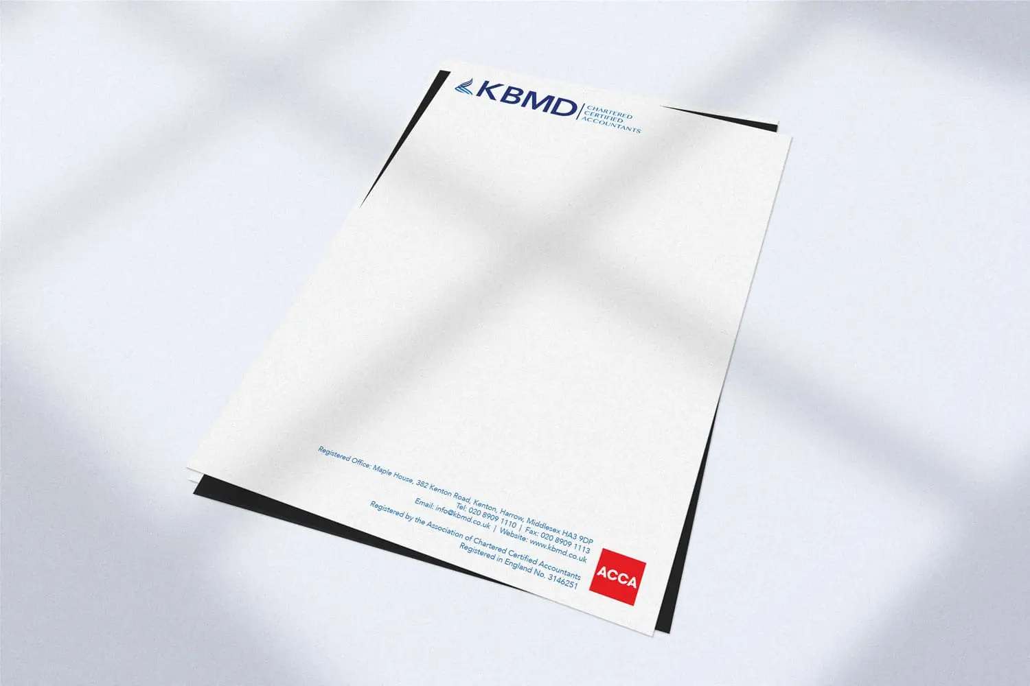
A clean, structured mark designed to hold up on everything from a business card to a formal report cover: precise instead of decorative, since a firm handling other people’s finances benefits from a logo that looks competent and does not date quickly.

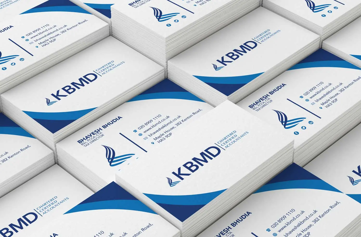
The result
An identity that fits the expectations of an accountancy client: professional, understated, and consistent across every piece of stationery it needed to appear on.
Want an identity that reads as trustworthy at first glance?
Available for projects
Got something like this, or nothing like it?
Tell me what you're starting, or what's broken.