Taur Security
Brand identity and print collateral for a security services firm.
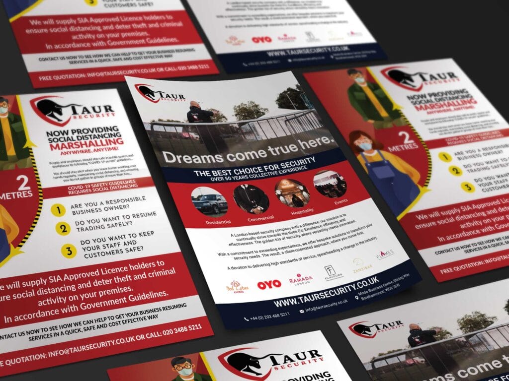
Taur Security: Brand Identity for a Security Services Firm
The brief
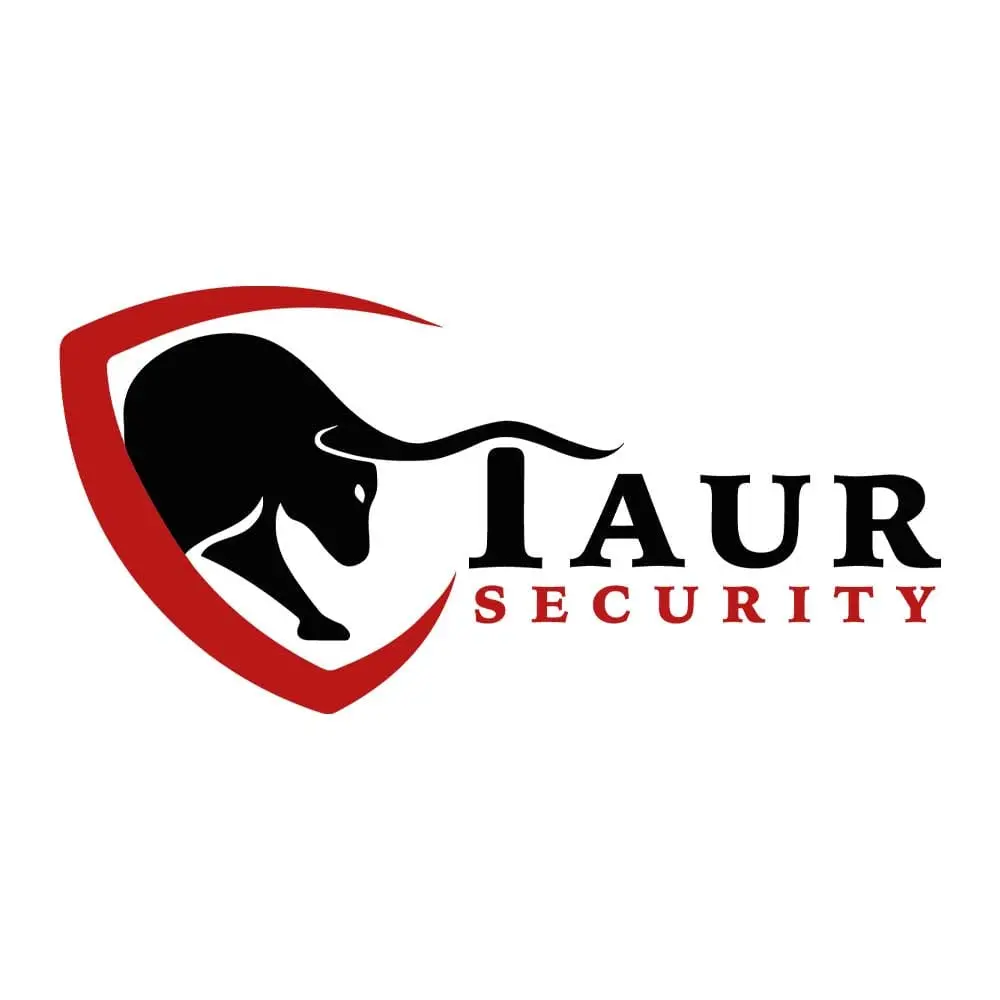
A security services company needing a brand that reads as strong and trustworthy without tipping into generic “shield and padlock” cliche: an identity built to differentiate the business, not tick the category’s usual visual boxes.
The build
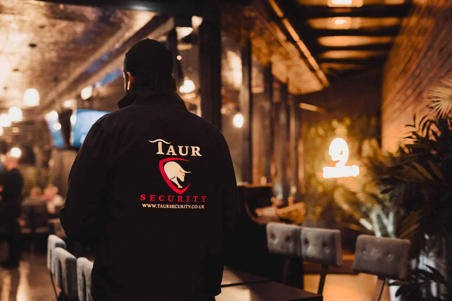
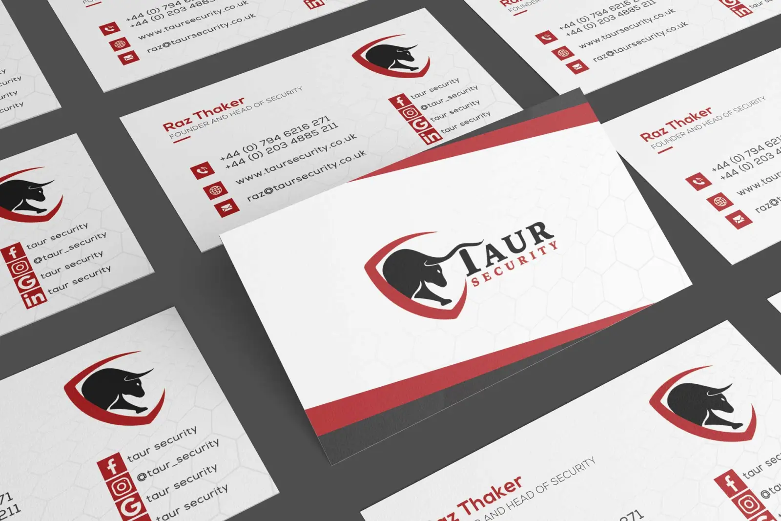
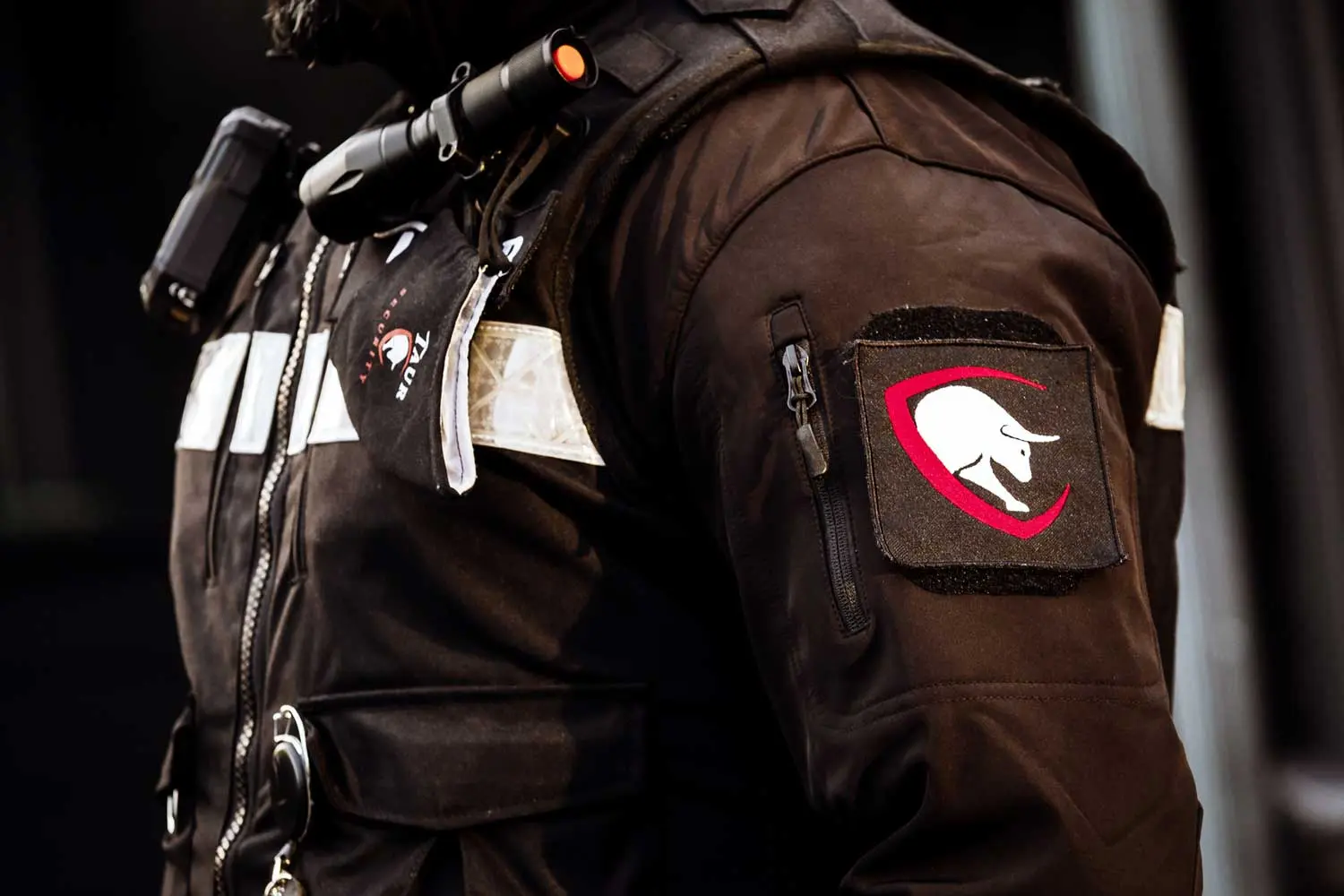
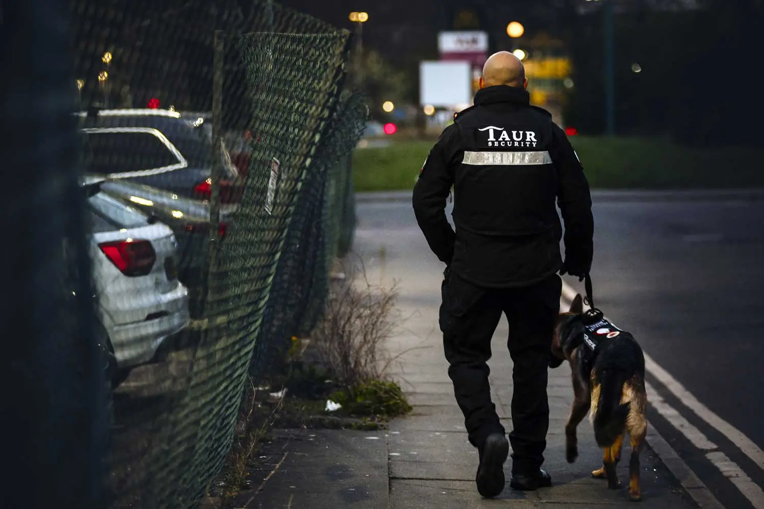
A bold, clean mark designed to hold up at any size and across any surface, uniforms, vehicles, digital platforms and printed materials, since a security brand’s logo has to work as hard on a van door as it does on a business card. The identity was built as a foundation the business could keep building on as it grew, not a one-off asset needing replacement the moment the company scaled up.
The result
A consistent, professional presence across every surface the business operates on, giving Taur Security a recognisable identity to build client relationships around from day one.

Looking for a brand identity built to scale?
Got something like this, or nothing like it?
Tell me what you're starting, or what's broken.