Vijay’s Virasat
Full brand identity and photography for a restaurant, from logo to menu design.
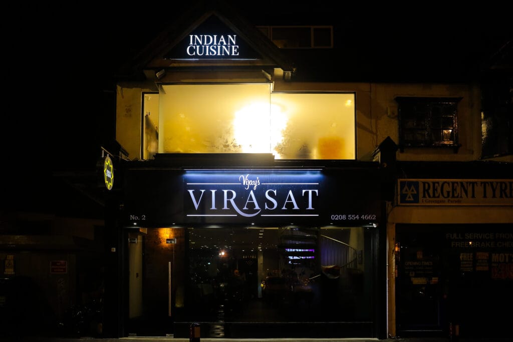
Vijay’s Virasat: Brand Identity for a Three-Generation Restaurant
The brief
A restaurant with a genuinely rare story: starting as Vijay’s Sweet Mart, growing into Vijay’s Chawalla’s street food, and now Vijay’s Virasat’s full vegetarian and non-vegetarian menu, spanning three generations of the same family. The brand needed to carry that real history, not invent a generic “authentic Indian cuisine” story from scratch.
The build
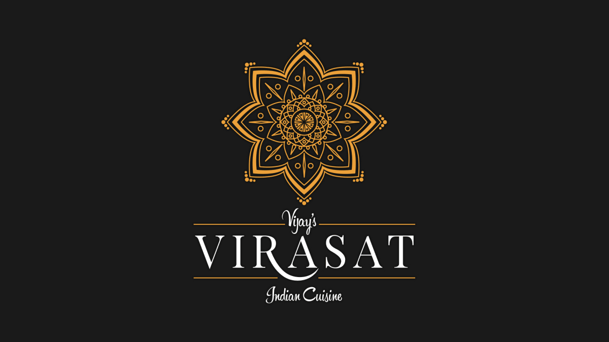
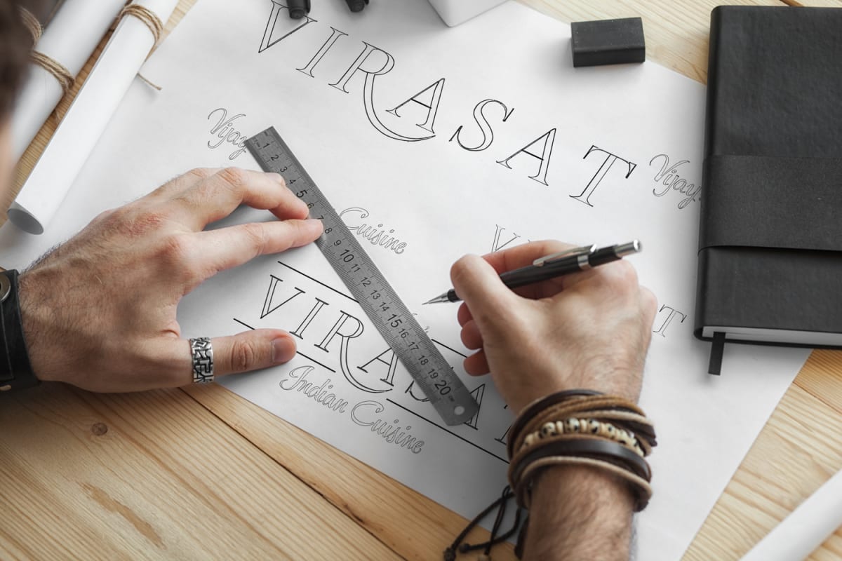
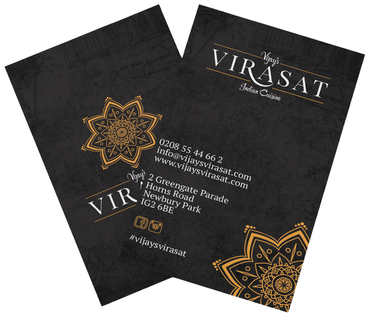
A logo drawing on traditional Indian motifs, paisley patterns and mandala forms, built with lines clean enough to stay legible across menus, signage and packaging instead of becoming an ornate mark that falls apart at small sizes. The colour palette (saffron, deep green, terracotta) evokes spice markets and traditional dining without tipping into cliche, paired with a serif and sans typography pairing that balances heritage against everyday readability on a takeaway menu.

The result
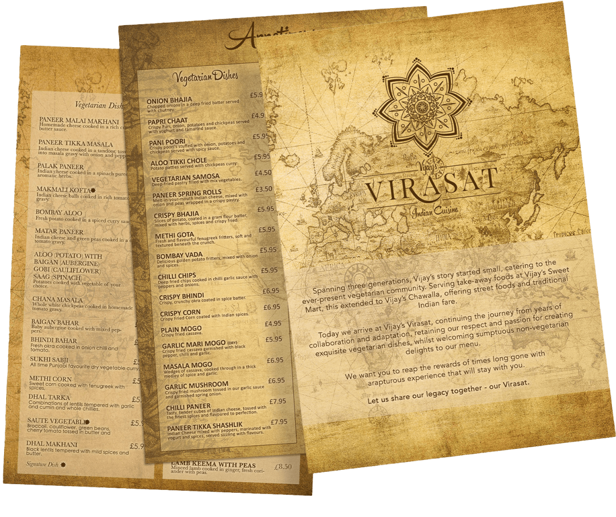
A brand identity that carries the weight of three generations of family history, positioning Vijay’s Virasat as a cultural anchor for the community it serves.
We are glad to have chosen Terence when branding our restaurant. From the moment we set the brief, his dedication was remarkable in order to meet tight deadlines.
For Branding a new business or updating your company brand, Terence is the man!
V Virasat (Google review)

Got a real story your brand should be carrying?
Got something like this, or nothing like it?
Tell me what you're starting, or what's broken.