SKV Renewables
Identity, print, van livery and a website for a solar and heat pump installer, with the same credentials and contact routes on every piece.
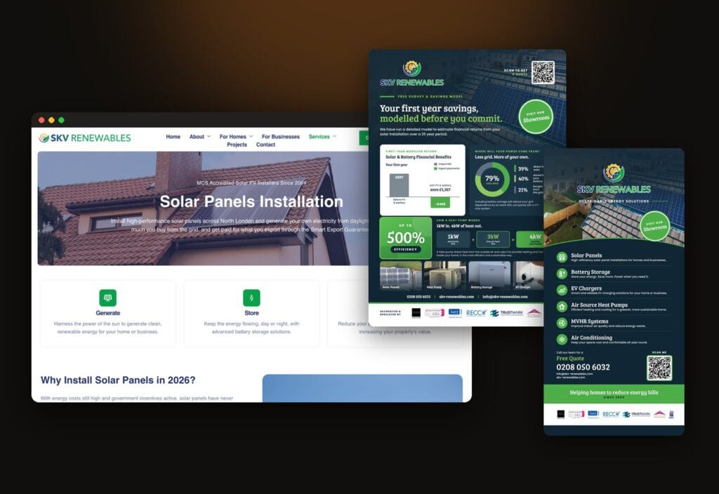
SKV Renewables: One Identity For The Van, The Flyer And The Website
The brief
SKV Renewables has installed solar panels, battery storage, air source heat pumps and EV chargers since 2004, across London, Hertfordshire and Bedfordshire. It is MCS accredited and TrustMark registered, and holds a run of other certifications on top: ISO 9001 and 14001, the IWA deposit and guarantee scheme, RECC, the Trading Standards Approved Code and NAPIT.
Energy work is a purchase made on trust. A homeowner cannot inspect a heat pump before it is fitted, so the evidence is the credentials, and the credentials only help if they are in front of the customer at the moment they decide. SKV also meets people in very different places: on the side of a van, on a flyer through the door, at a counter, and on a phone after a search.
The brief was one identity that holds up in all of those places and shows the accreditations every time, rather than a different look for each format.
The work
The identity came first. The logo was set up as a family of lockups: a full version, the emblem on its own, a text only version, a flat version and a white outline version for dark backgrounds, so every format has a version that sits cleanly on it. The palette is a deep navy and a clear green taken from the mark, and it runs through everything that follows.
Print was built as a set rather than as separate jobs.
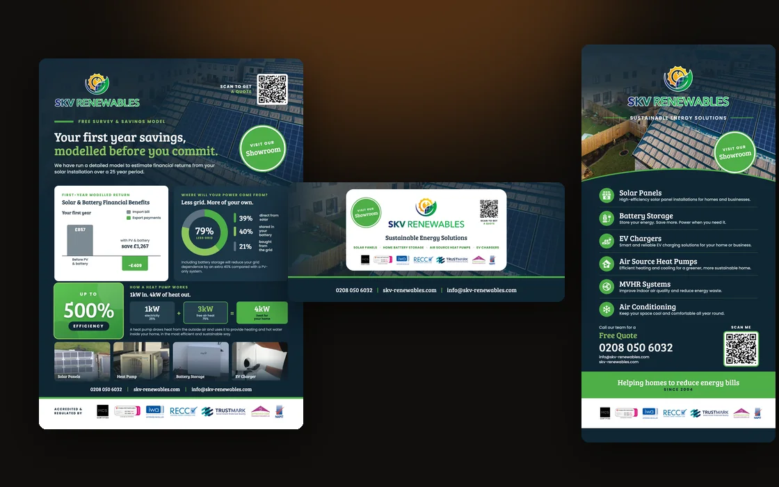
There are A5 flyers, two roller banners and a counter pop-up. Every one carries the same three ways in: the phone number, the web address and a QR code labelled scan to get a quote. Every one carries the same accreditation strip. One of the flyers leads with a modelled first year savings example for a solar and battery system and a breakdown of where a home’s power comes from, with the four services as a strip underneath instead of the headline.
The van livery was drawn to the van’s own template, with the sides, front and rear each designed as a separate panel.
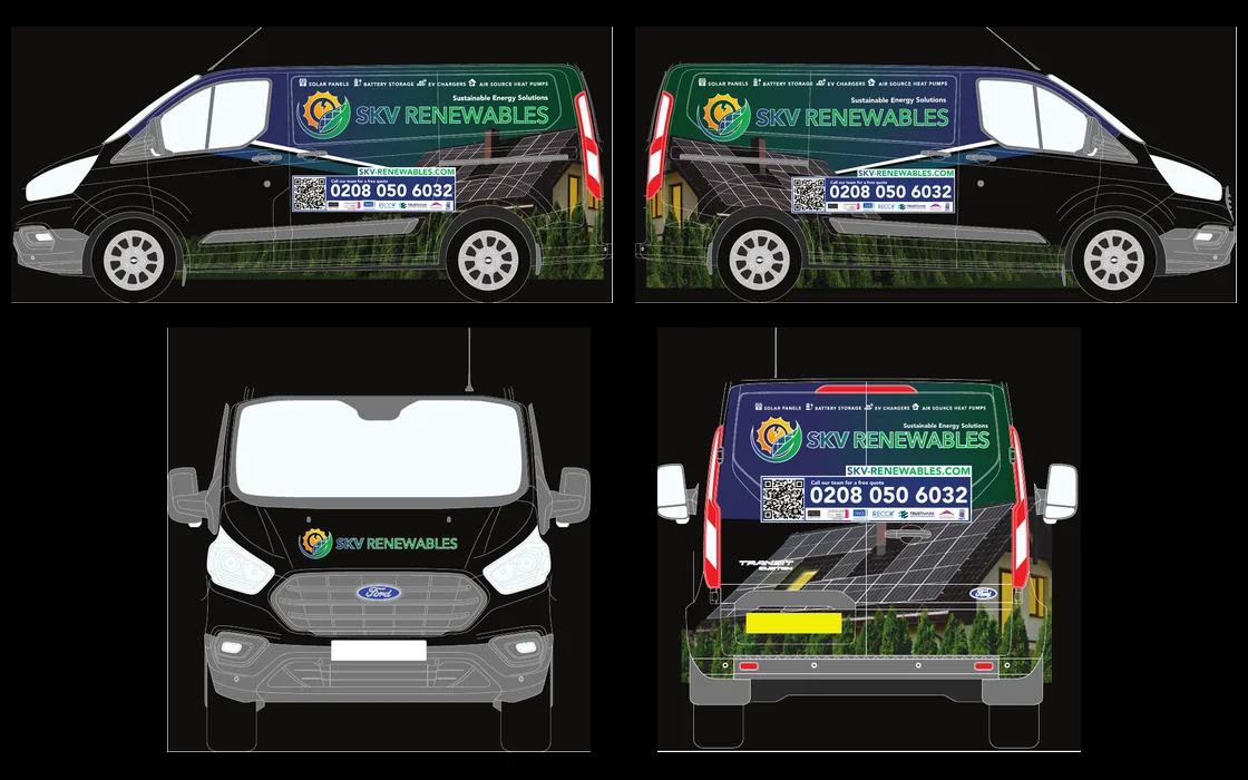
The logo is large on the sides and rear, and the four services run across the top. Below the logo sit the phone number, the QR code and the accreditation strip in one block, so someone who sees the van once has everything they need to get in touch.
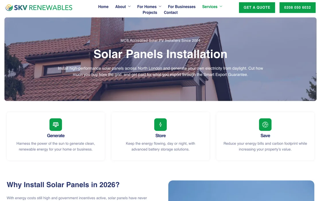
The website is built on WordPress and organised around how a customer decides rather than how the business is structured. A visitor can come in by property type, with pages for existing homes, new builds and businesses, by service, with a page each for solar panels, battery storage, heat pumps and EV chargers, or by area, with pages for North West London, East London, Hertfordshire and Luton. Four project write-ups show completed installations. The Get a Quote button and the phone number sit in the header of every page, and the lockups, colours and credential strip carry over from the print.
The result
SKV now has one recognisable business across the van, the print and the website. The logo, the colours, the credentials and the three ways to get in touch are the same on every piece, so someone who sees the van, picks up a flyer and then searches the name lands on a site that reads as the same business.
It is also a set that can grow. A new flyer, another vehicle or a new service page starts from the same lockups, palette and credential strip rather than from a blank page.
Measured: on 6 October 2026 the live homepage was tested with Google Lighthouse (desktop). Across five runs it scored 74 to 92 for performance, 93 for accessibility, 73 for best practices and 100 for SEO. On 3 October, before a round of speed and accessibility work, performance was 64 and the largest contentful paint was 5.1 seconds; it is now 1.7 seconds. Best practices is held at 73 by third-party cookies set by tools the business runs itself. Anyone can repeat the test and will see differences from run to run.
Selling something customers cannot see before they buy?
When trust rests on credentials, the brand has to carry them everywhere the business shows up.
Got something like this, or nothing like it?
Tell me what you're starting, or what's broken.